LogoPrimary
LogoGlyph

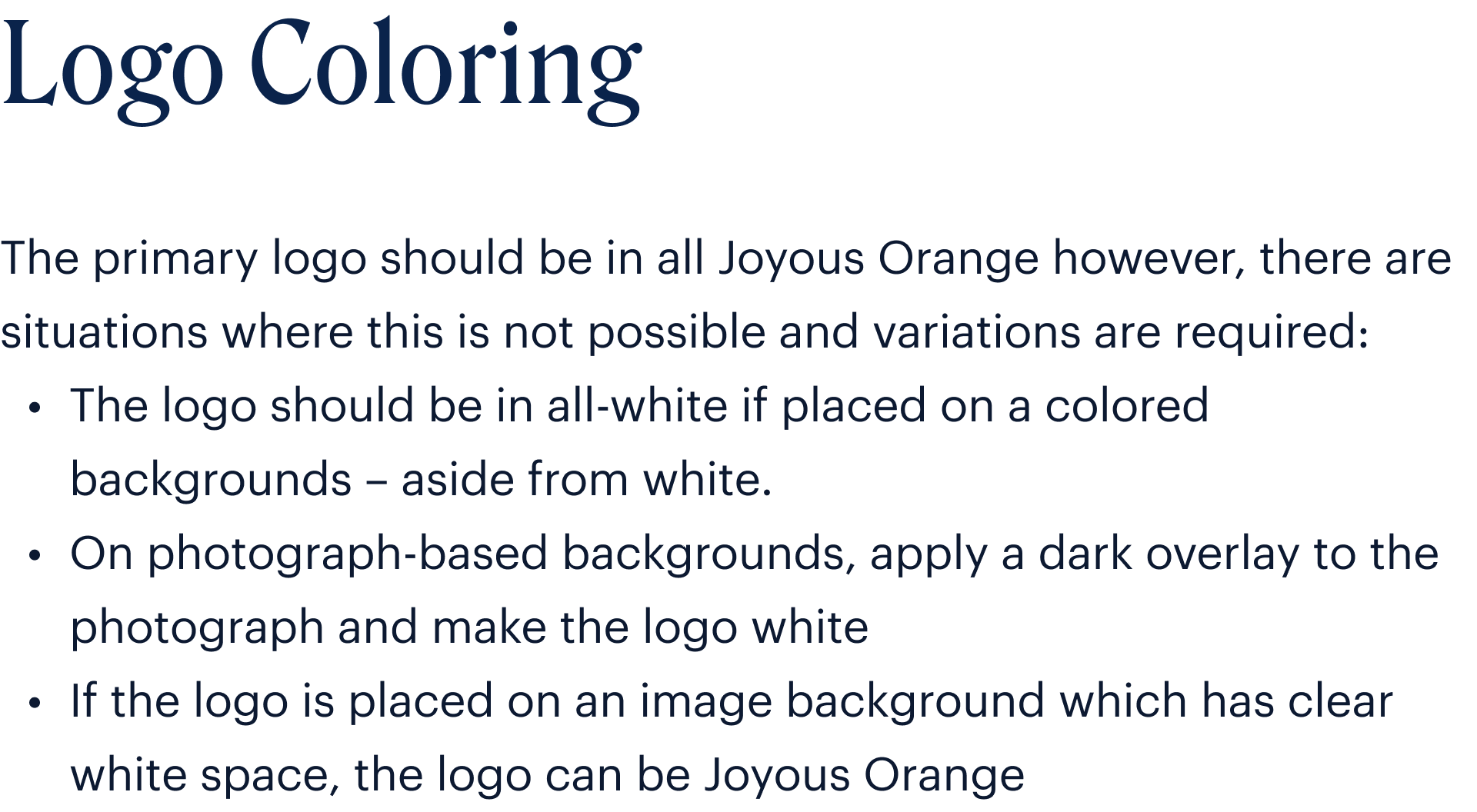
LogoColor
LogoMonochrome
The monchromatic logo should only be used when not enough colours are available to reproduce the primary logo.
LogoGlyph Construction
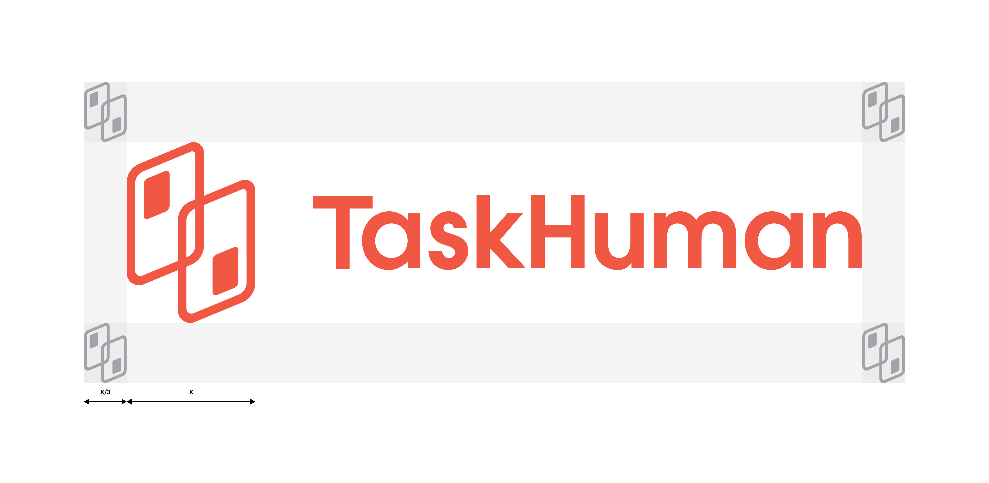
LogoClearspace
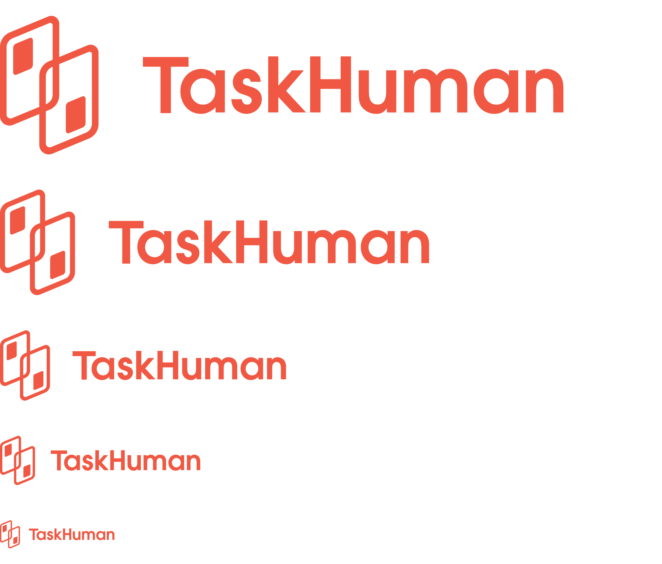
LogoSizing
The logo is designed to scale to all sizes on print and screen.
Smallest size:
48 pixels tall
0.4 inch tall
LogoGlyph Usage
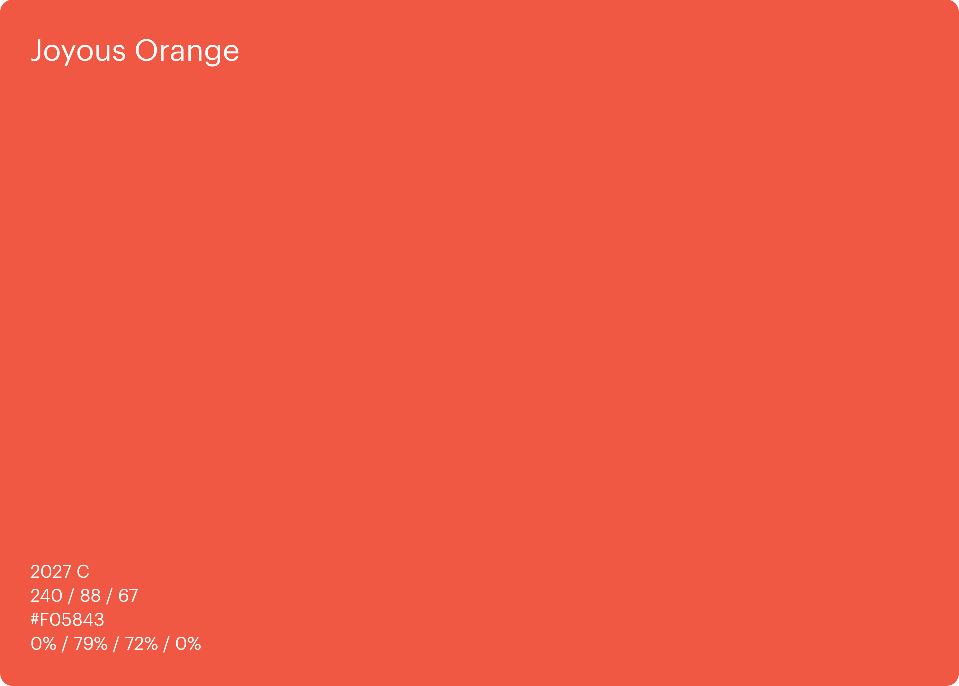
ColorPrimary Palette
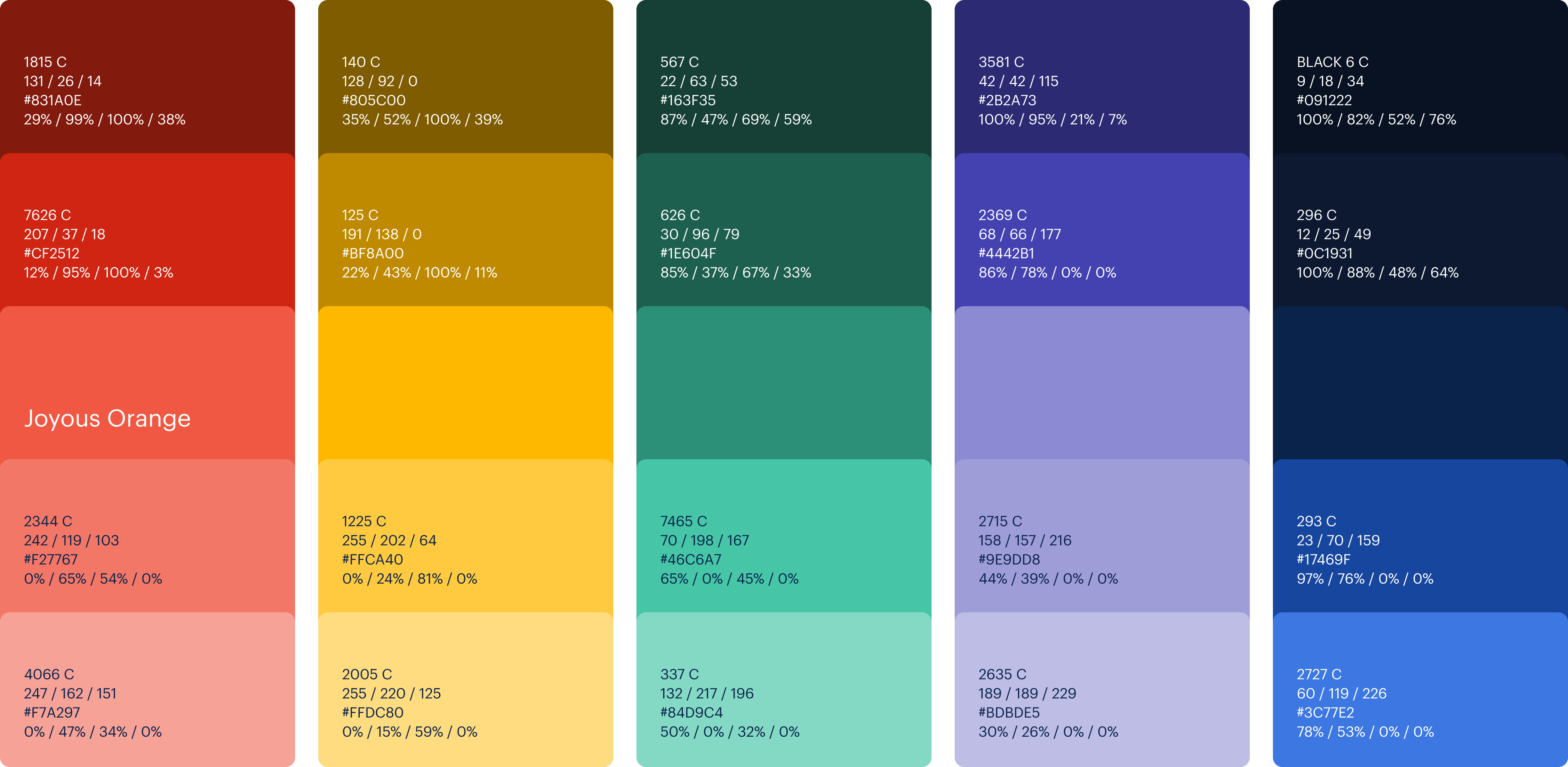
The TaskHuman visual identity revolves around Joyous Orange and should be used in whatever you create. To make this color synonymous with TaskHuman, we’ll leverage an entire family of oranges.
ColorNeutral Palette
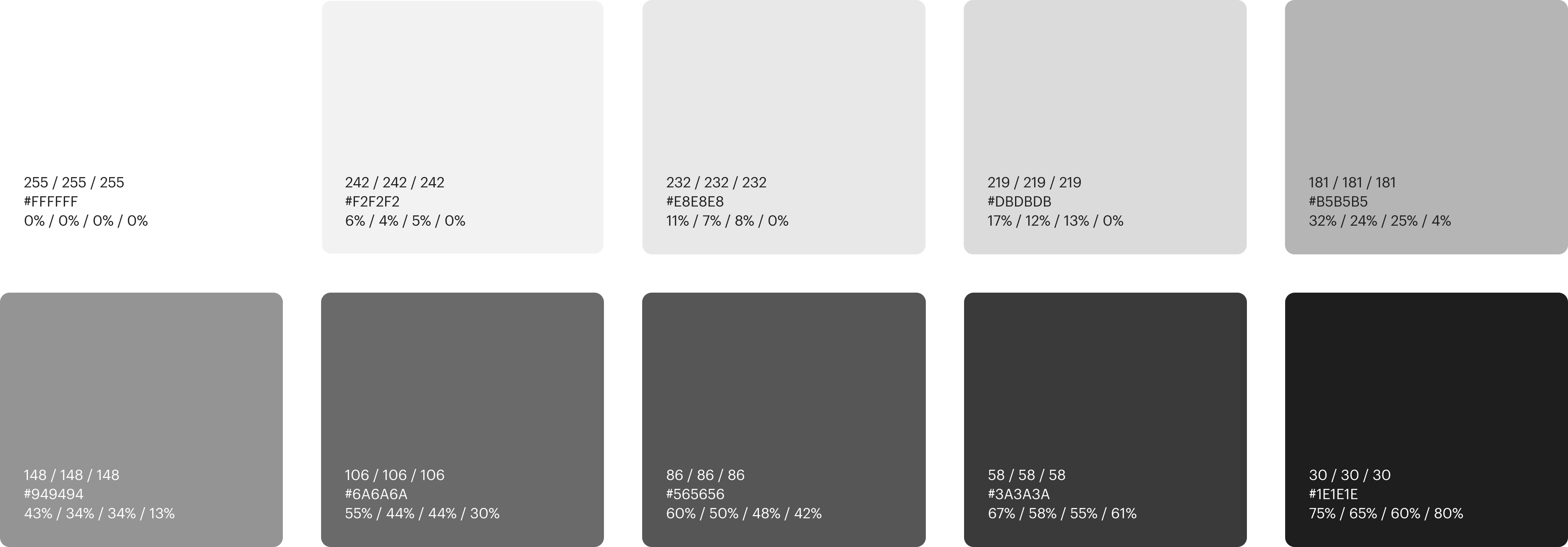
A vital part of any brand is the utilisation of neutral colors. Whites and grays provide clarity and definition and should be used across all designs. Whether that’s for text, functional applications or simply to provide space.
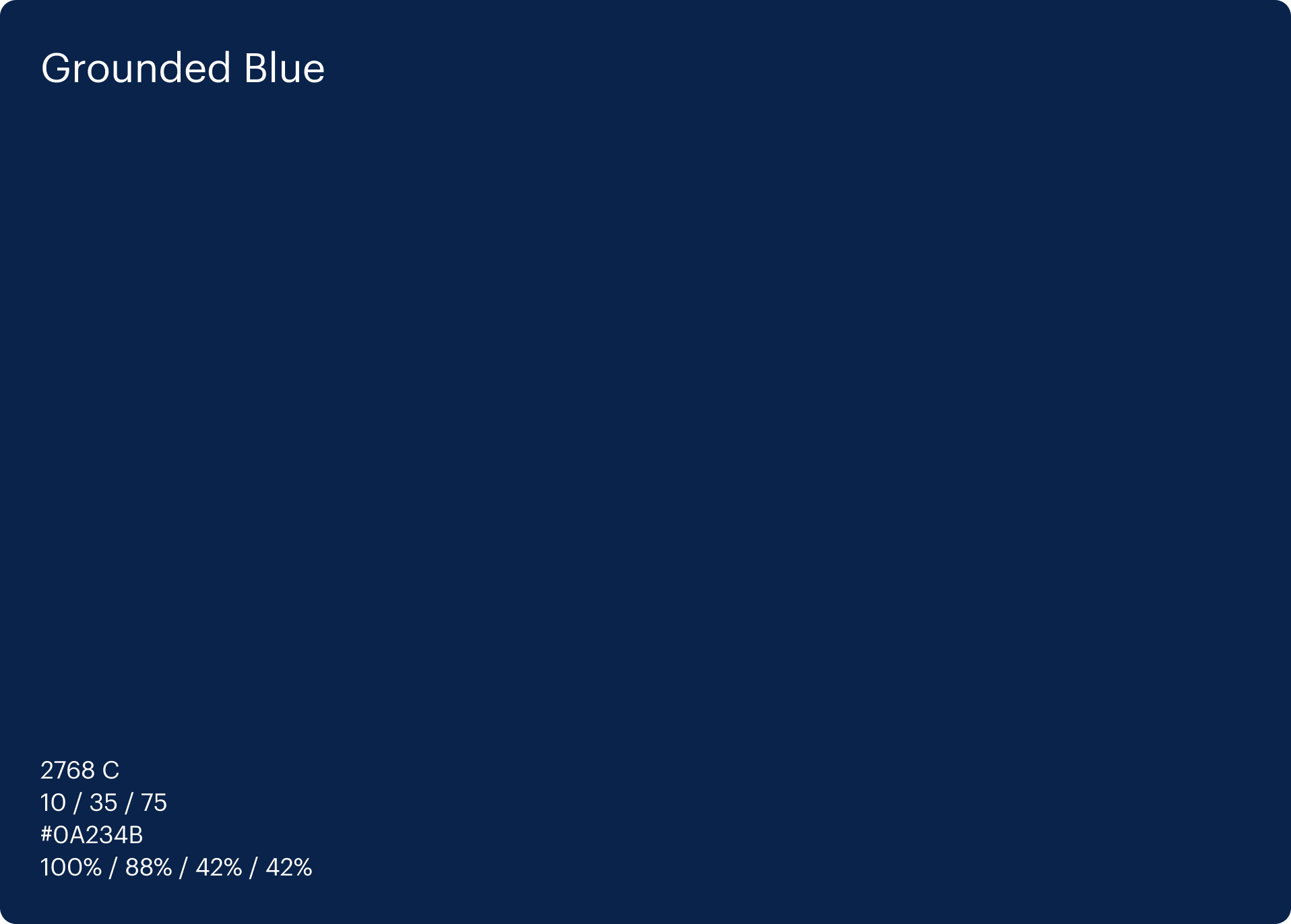
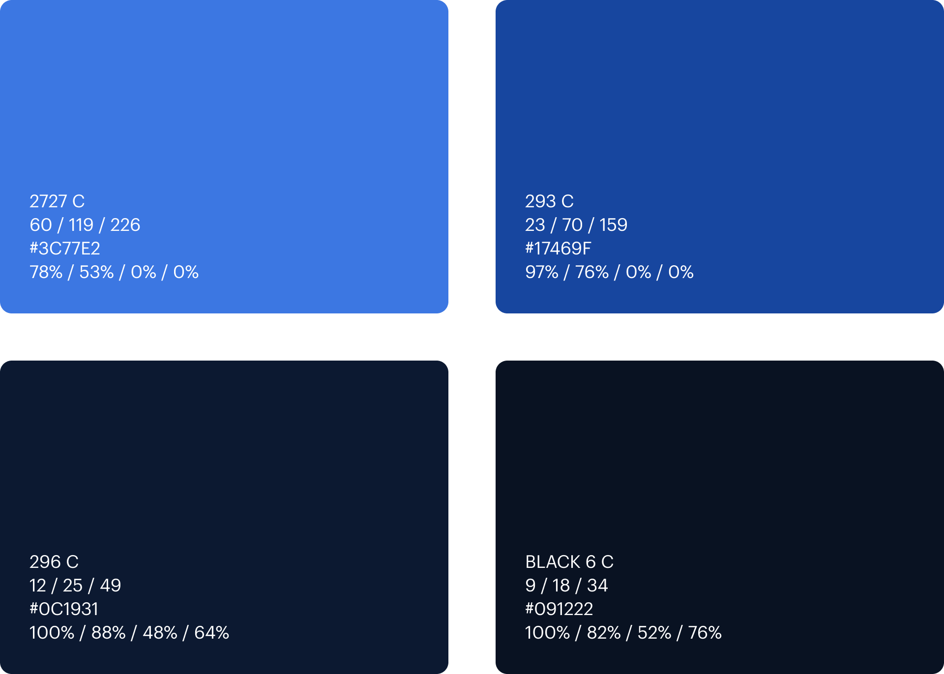
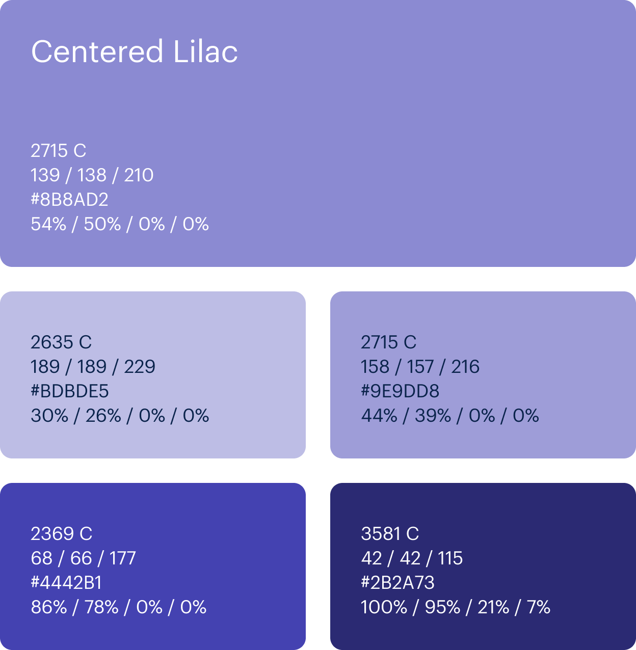
ColorSecondary Palette
To provide strong contrast against the Primary and Neutral palettes is the Grounded Blue family. This Secondary palette is much more pleasing alternative to blacks and dark greys when it comes to text or large fills and backgrounds.
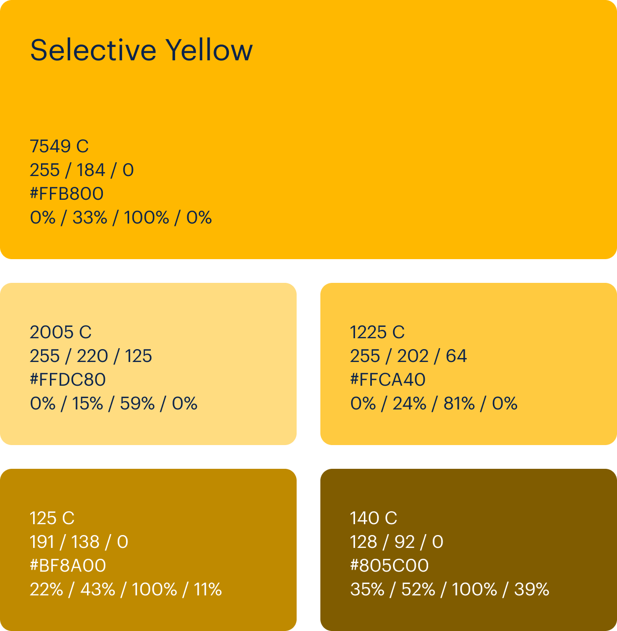
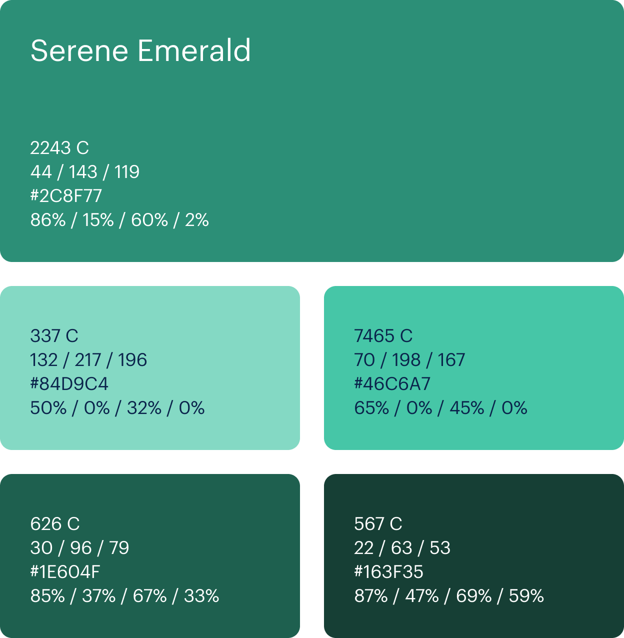
ColorTertiary Palette
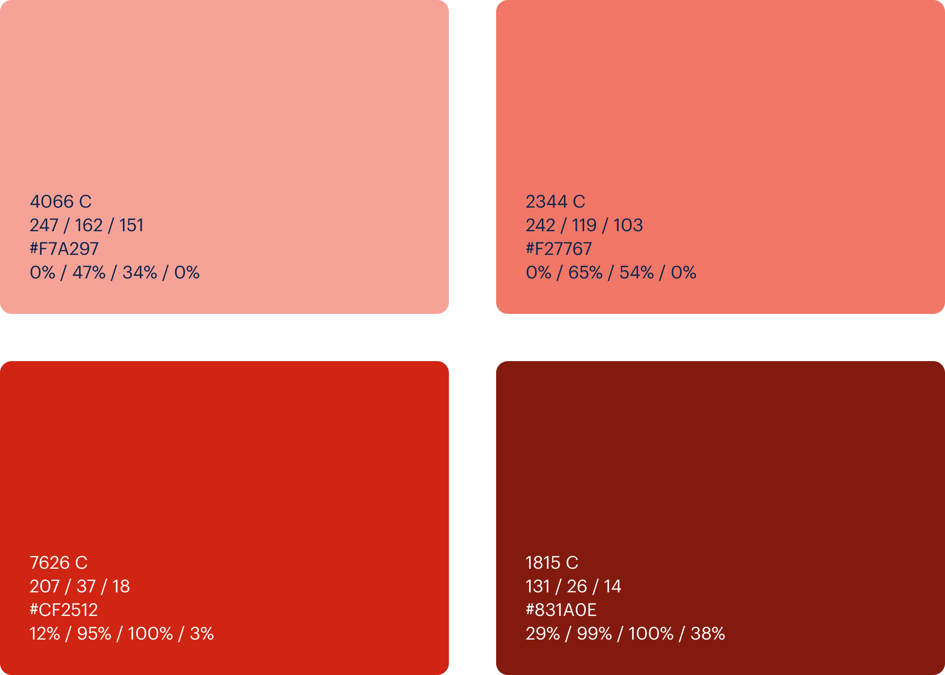
To compliment Joyous Orange is a range of Tertiary colors to give vibrance and variety to the brand. These additional colors can be used in array of ways such as illustration, but should be used sparingly as to not compete with the primary brand colour. Ideally its usage is limited to partnering only with the Neutral palette.
ColorExpanded Palette
ColorUsage
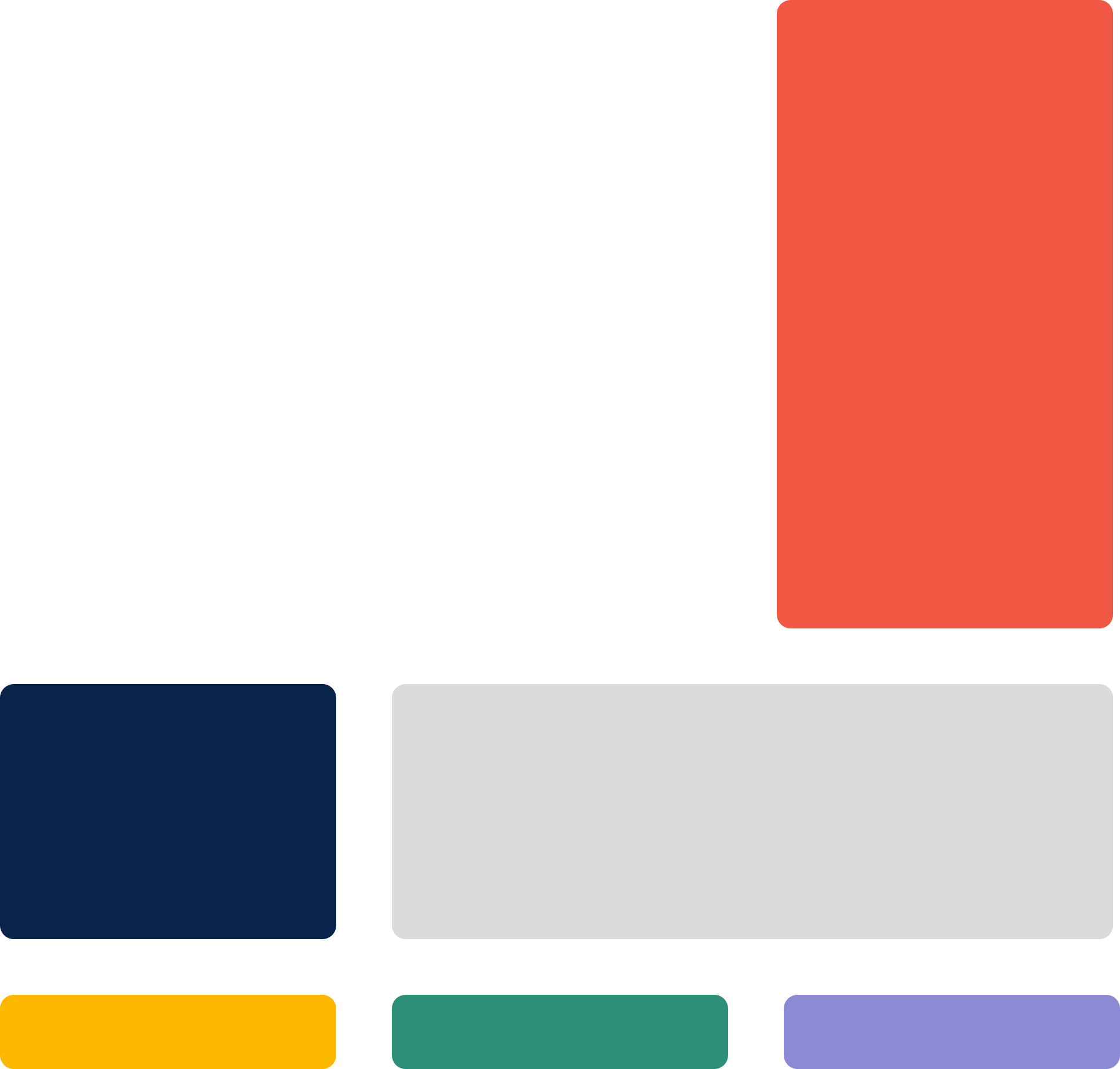
The ratio of color throughout the application of the brand is important to maintain. White will be the main color due to its preference as a background colour, this will be followed by the Primary palette and then the Secondary palette.
The application of Tertiary colours are to be used as previously stated. After this, it will be a combination of Neutrals to help with text, messaging as well as background contrasting.
The diagram is a simplified representation of how much each key color should be used.
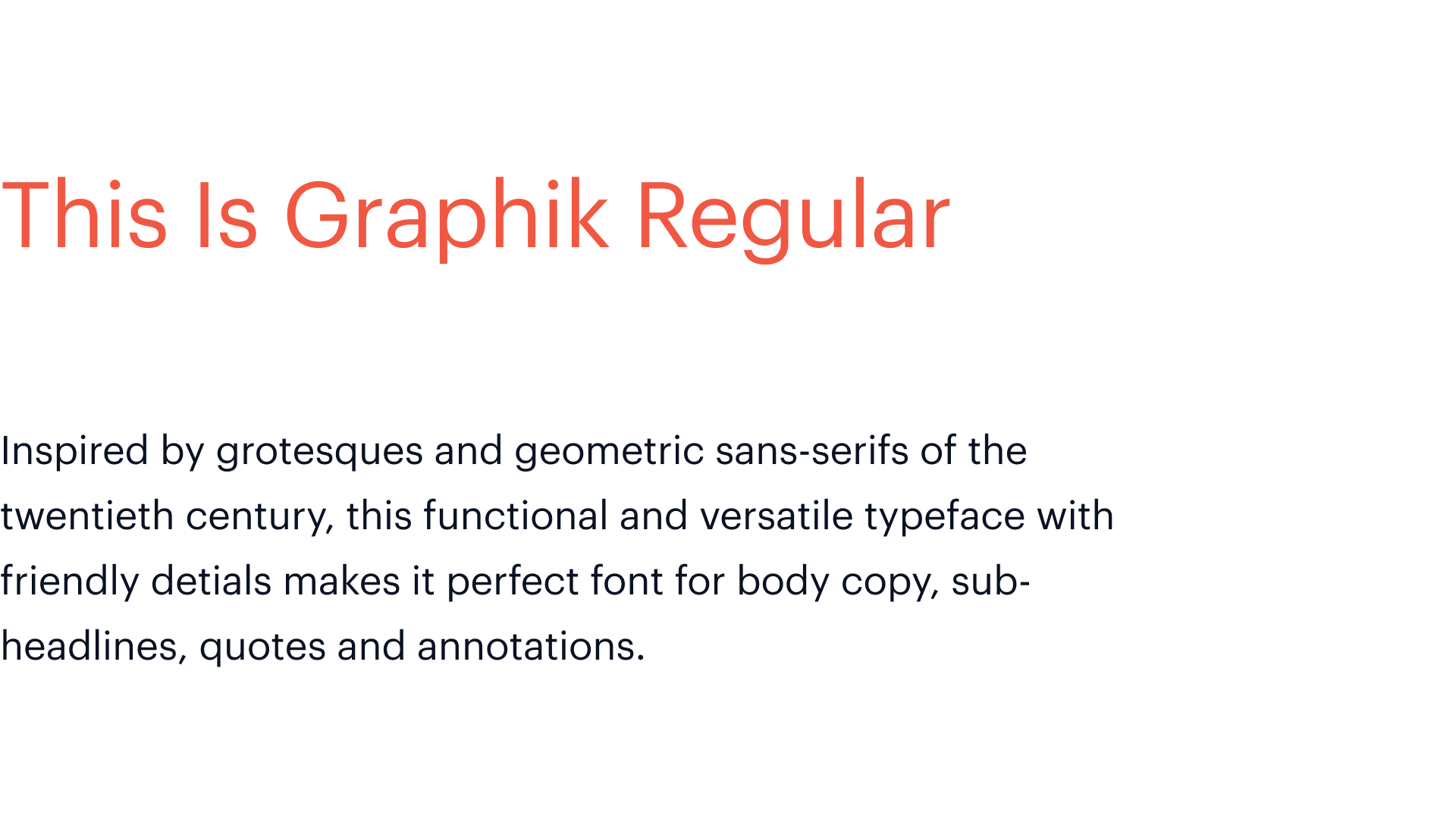
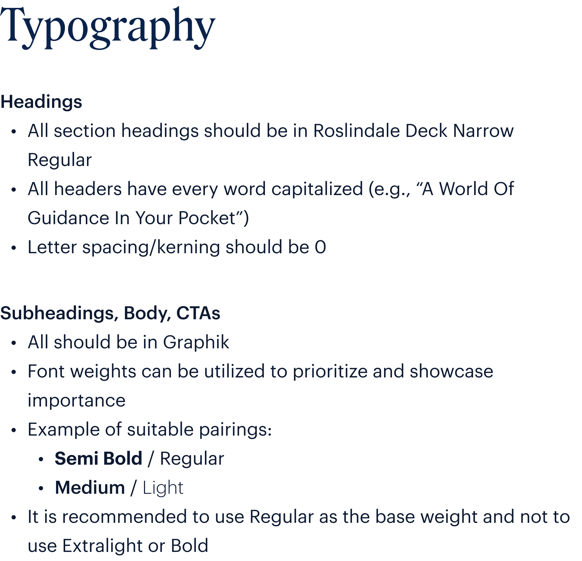
TypographyBasics
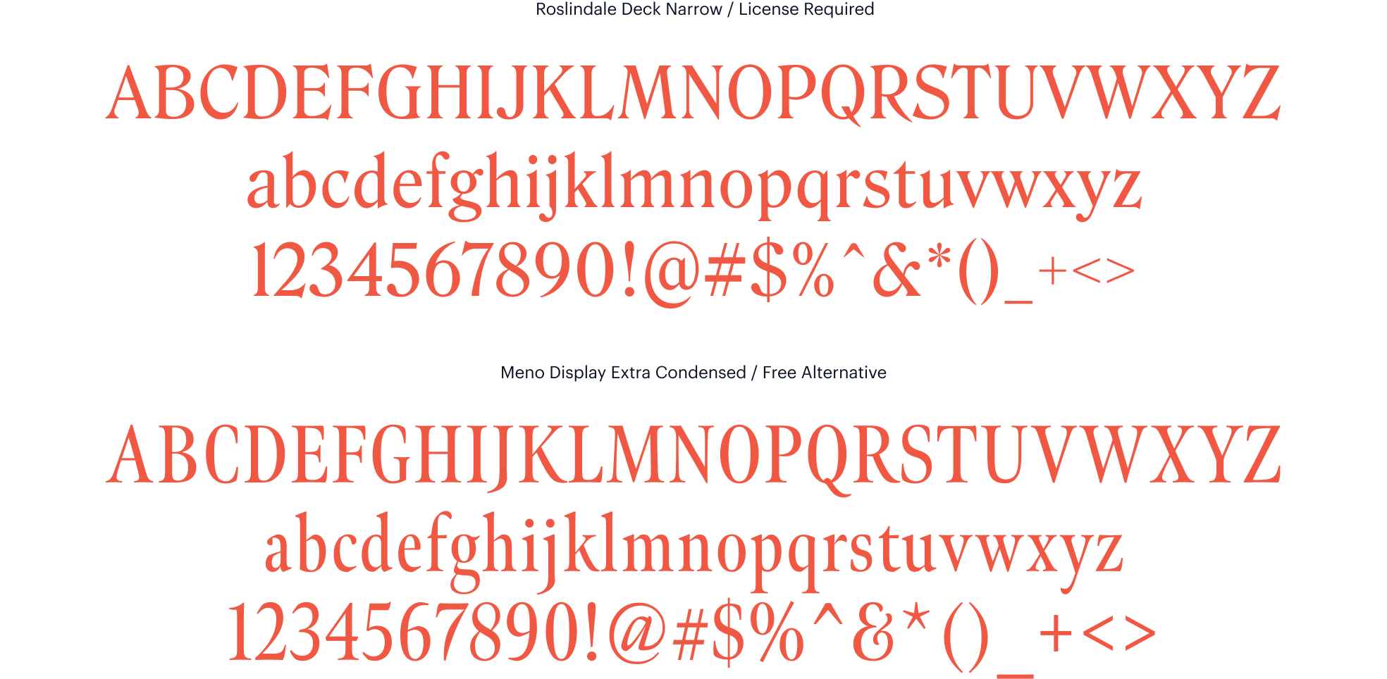
Typography for the new identity will lean on two fonts; Roslindale and Graphik.

TypographyHeadings
TypographyBody

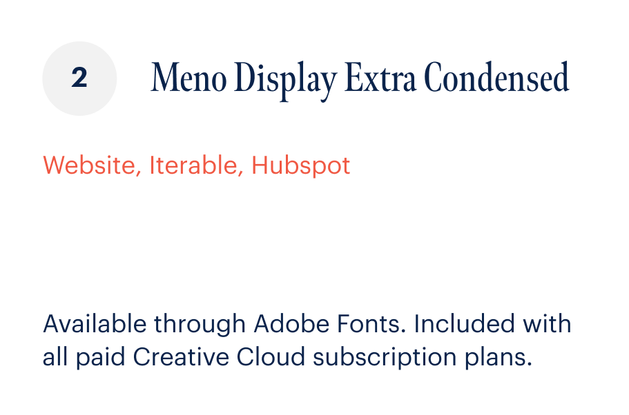
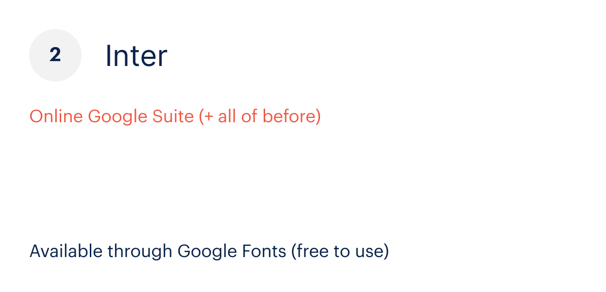
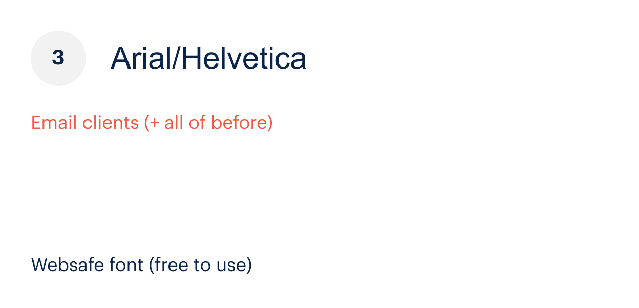
TypographyFail-safe
As much as our aim is to utilise Roslindale and Graphik as much as possible, there will always be instances where certain softwares/technologies are closed or have limitations. This therefore, makes it imperative to have fail-safe fonts in place.


TypographyPairings
To ensure cohesion and clarity across all brand messaging, it is important to organise typography into a hierarchical system. This can either be achieved by using a combination of the two brand fonts or through the implementation of various font weights. When using weights, it is vital not to exceed more than a total of 3 font weights.
Example of suitable pairings:
Bold / Regular
Semi Bold / Regular
Medium / Light
Note:
Remember to adhere to font selection rules when dealing with pieces of text with various levels of importance i.e. Heading, Sub-heading, Body

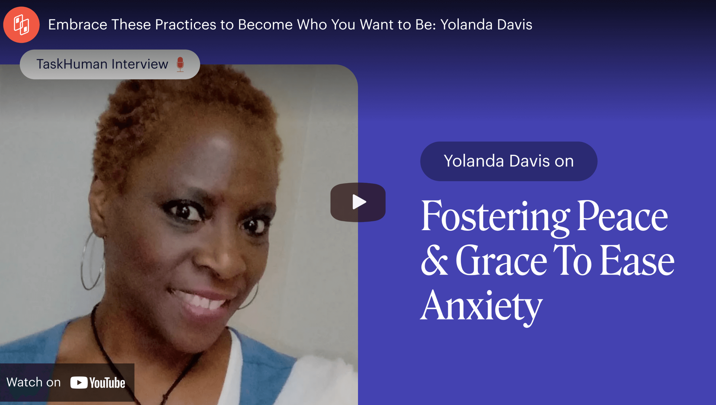
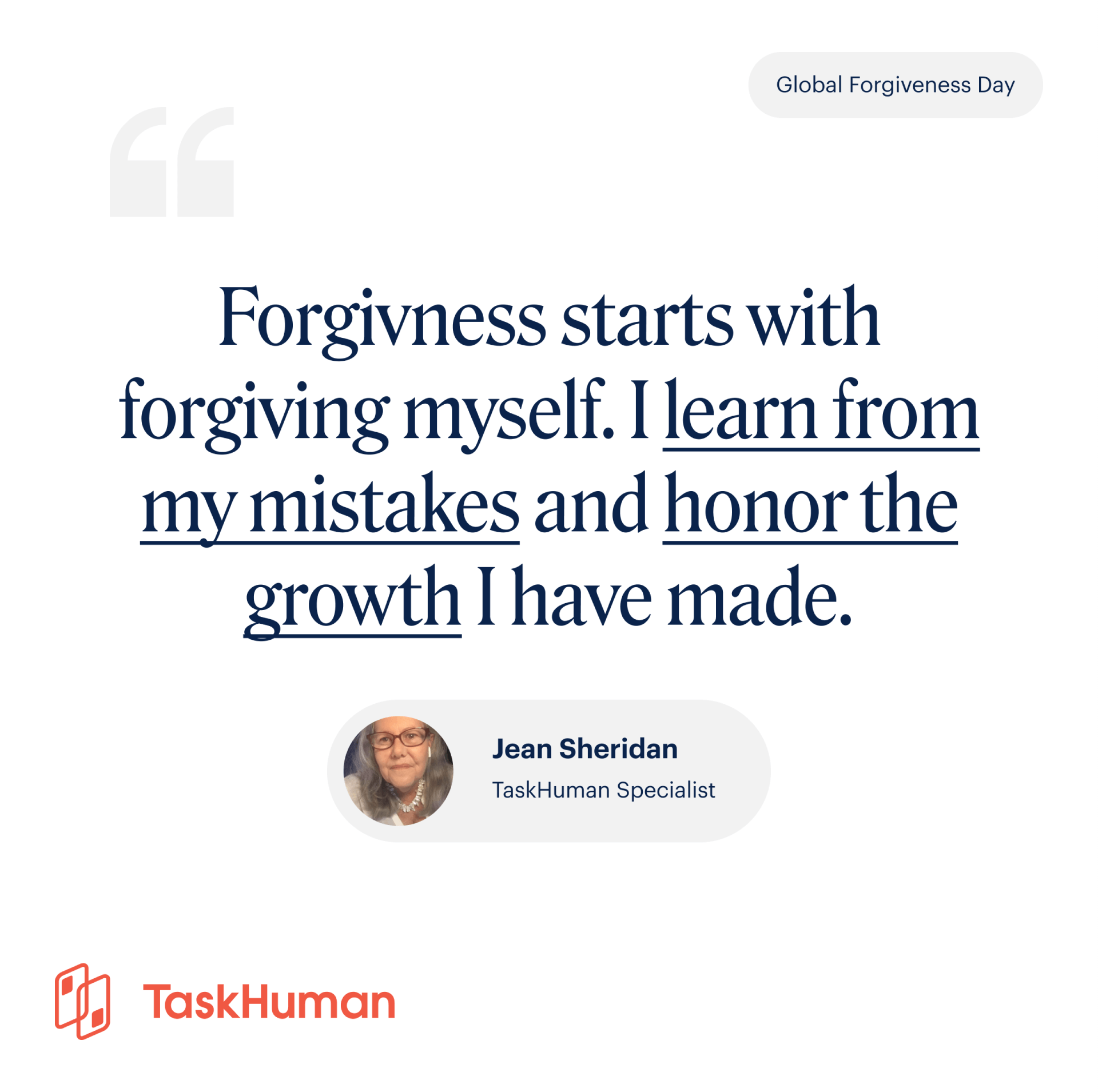
PhotographyDirection
TaskHuman photography should always be authentic and personable. The goal of each image is to help make TaskHuman relatable to our customers. Whether it’s a friendly face or an aspirational moment, each photo should connect with our audience – young and old, local and global.


IllustrationGuidelines
Illustration helps breathe life into our brand. It can take a complex idea and make it easier to understand. It is a tool that allows us to complement and communicate our product in a way that feels human and fun. TaskHuman illustrations should always be simple and minimalist in nature while being scalable and culturally sensitive due to our global clientele.
- Minimal details (no highlights, unnecessary details, no facial details i.e. eyes, freckles etc)
- Straightforward
- Diverse (body types, hair treatments, ethnicities) when applicable
Illustrations are used to bring our interface to life. They’re used to educate the user and help draw attention to specific features across our platform. Illustrations are purposeful, thought-out, and straightforward in nature.
IllustrationStyle
Our hero illustration style is bold, elegant, and professional. It is a visual representation of our Brand Personality. Hero illustrations help communicate essential TaskHuman messages and are often paired with a product or category launch or campaign. We use these illustrations consistently and repeatedly to help reinforce the meaning of the illustration in the mind of our customers.
IllustrationColor
Our color palette was chosen carefully with the business in mind. It’s a blend of both corporate and consumer to highlight our B2B2C nature and was chosen to complement our wide range of clients. Our aim is for our illustrations to delight the end-users without dismissing our corporate nature.
We primarily feature TaskHuman White, Joyous Orange, and Navy in illustrations unless the audience is already very familiar with TaskHuman. The extended orange and blue color palettes are used to add depth and variety to an illustration. Use our Secondary Palette for a Veteran Audience keeping in mind the color usage guidelines.
IllustrationUse of Characters
We refrain from using characters/people where possible. The use of a character opens up questions regarding race and gender, and due to our wide range of clients and global offerings, it’s best to simplify as much as possible.
IllustrationShapes
Shapes are made of solid colors. We do not outline them. Depth is created by differing color tones.
IllustrationStroke Caps
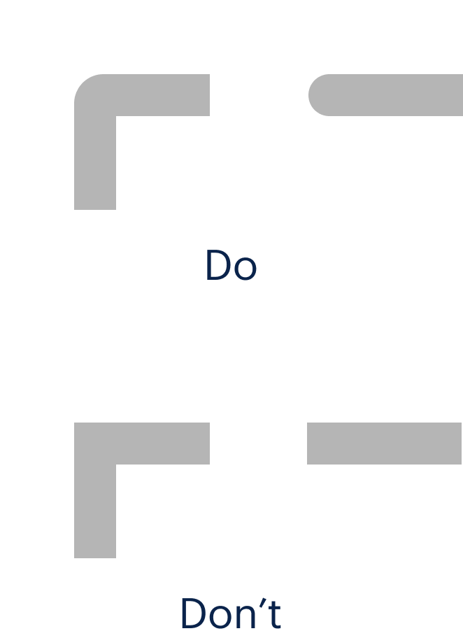
We use a rounded cap at all times to work alongside our rounded corner approach.
IllustrationActivity
We want to show people in action. Their actions can metaphorically represent communication, building, engagement, etc. Generally, we do not illustrate characters using their phones unless it is a scene illustration.
IllustrationTypes
Our Spot Illustrations
A spot illustration is used to help showcase a small feature or explain an experience. Typically these are to communicate the topics offered in our app. They’re straightforward, not too busy but are there to help enhance the flow by bringing the interface to life and delighting the user.
Our Empty State Illustrations
An empty state illustration is used to explain a feature but should never be the primary focus of the component. It is used to main as a way to address the need to fill an empty area but it also gives us a way to energize a possible lifeless area.
Our Scene Illustrations
A scene illustration works on a larger space and allows the user to explain a feature or a scenario with a more detailed driven approach. In these instances, scene illustrations are more emotive and abstract in nature.
VoiceTouchpoints
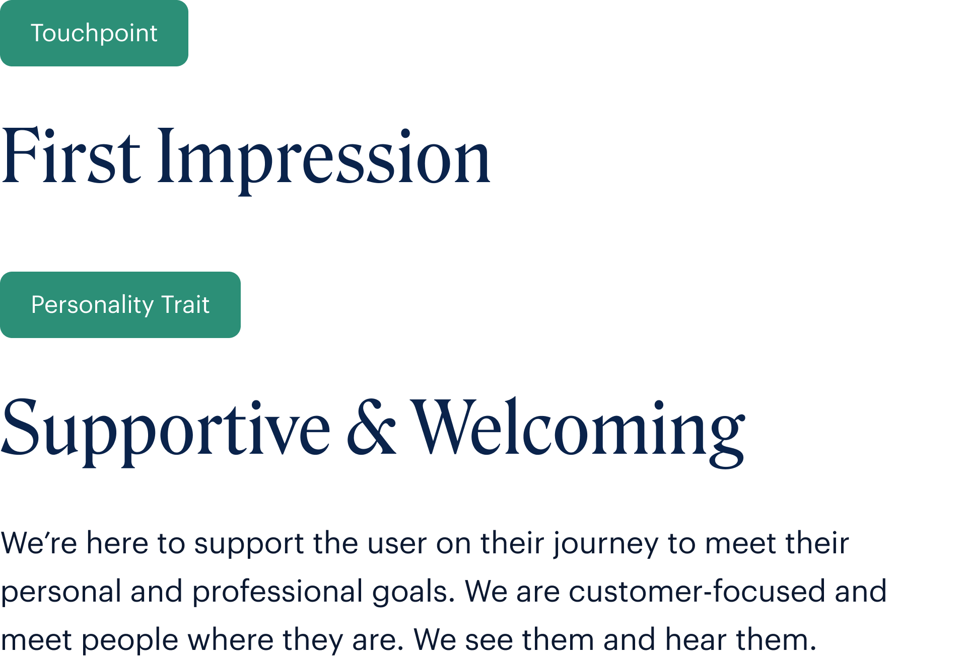
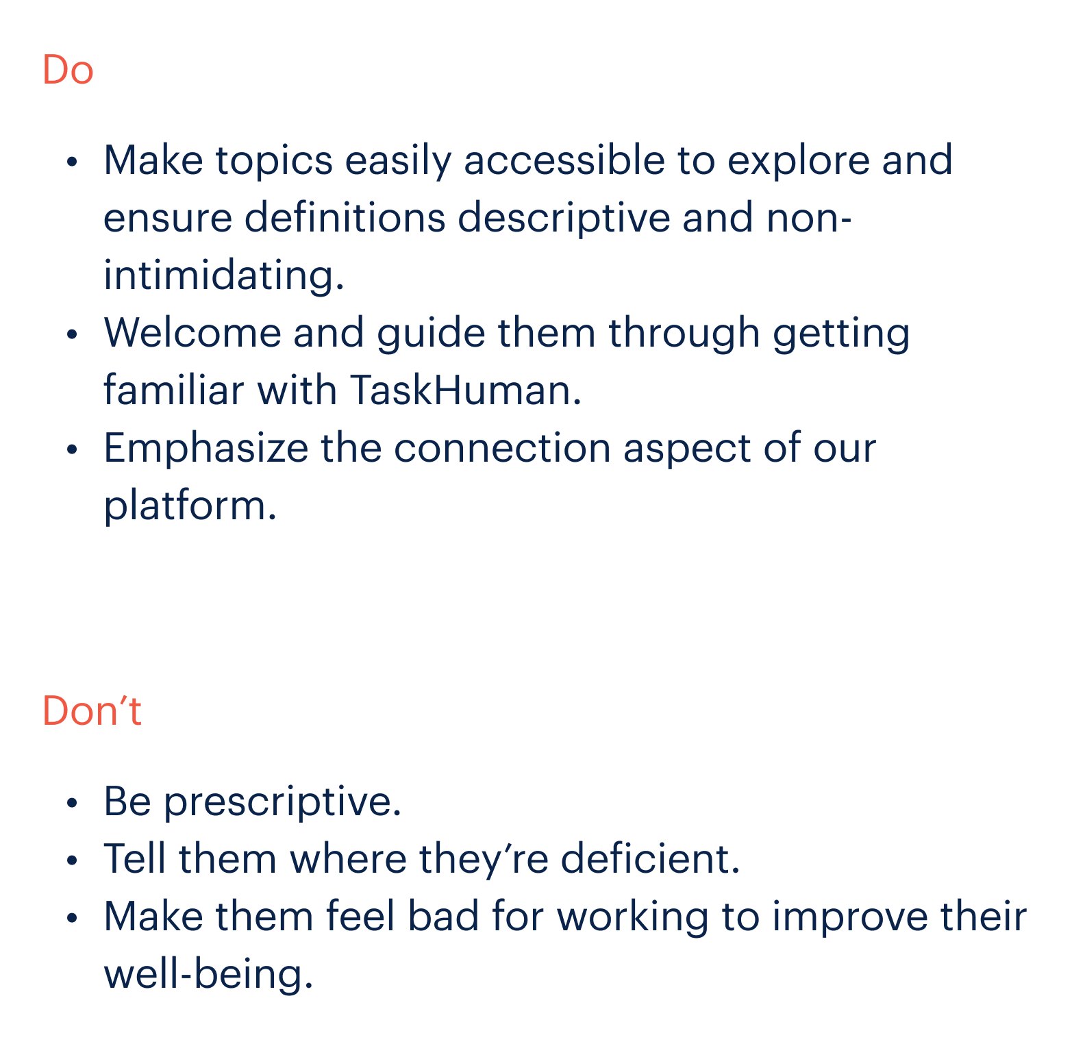
VoiceTouchpoints

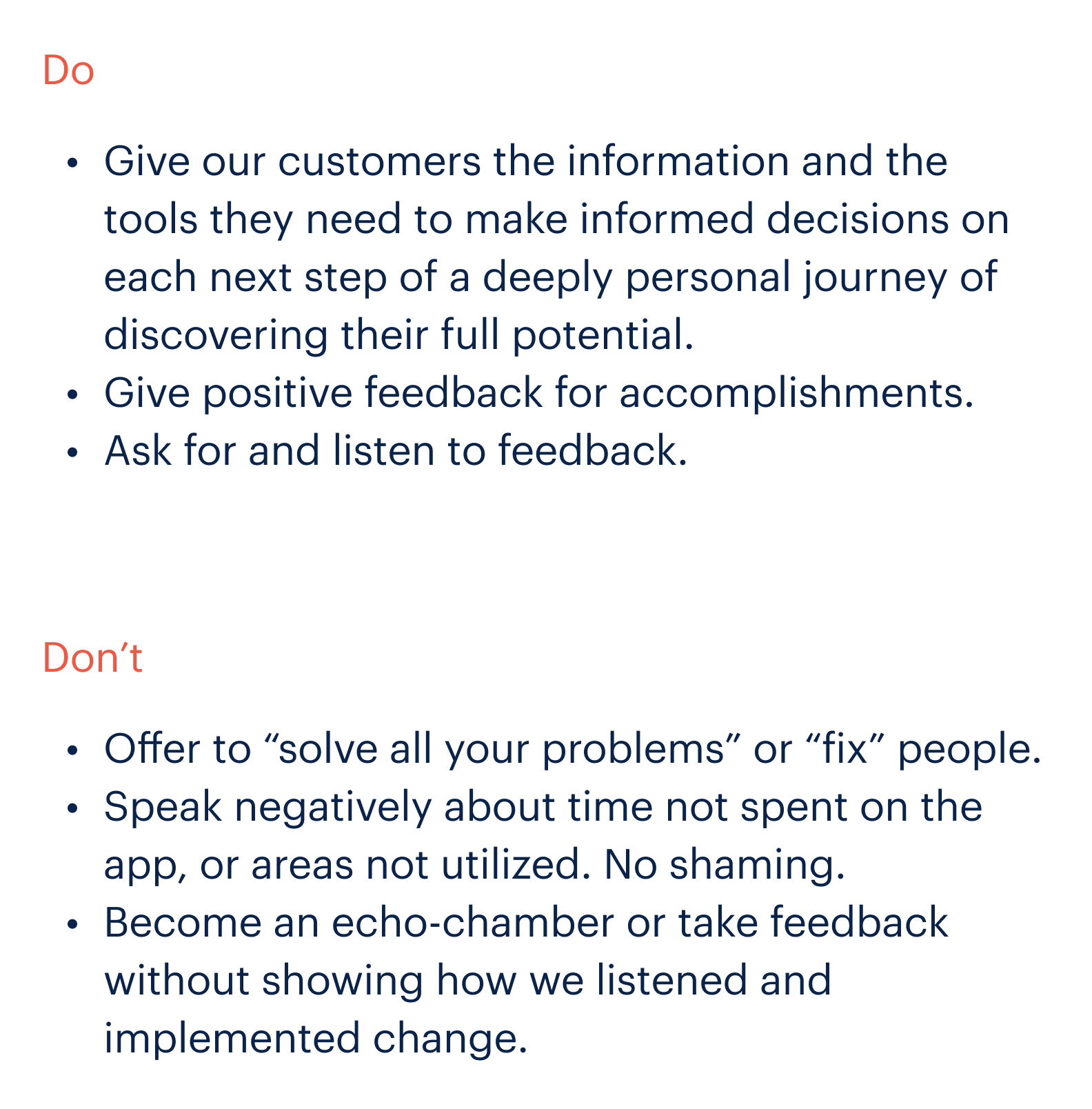
VoiceTouchpoints


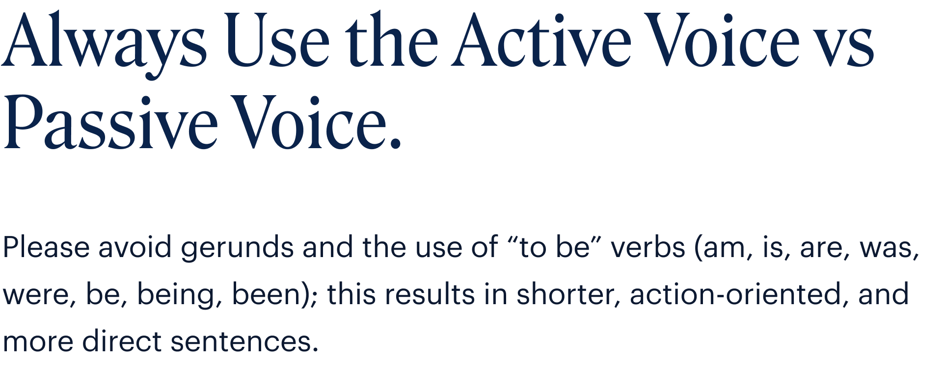
VoiceActive vs Passive

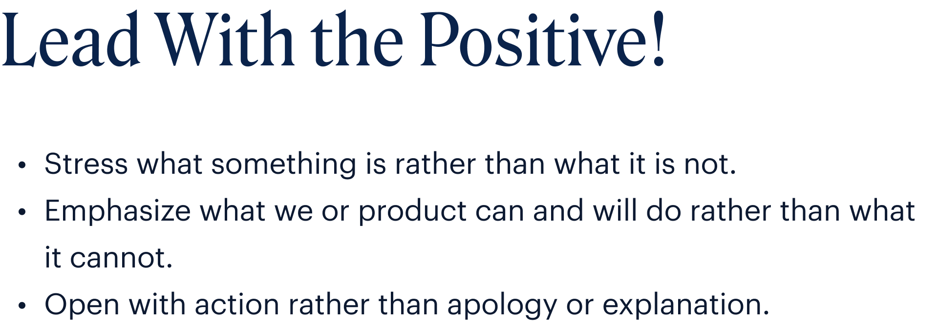
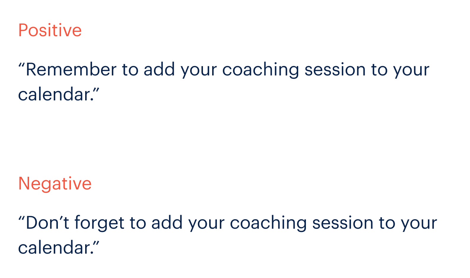
VoicePositivity
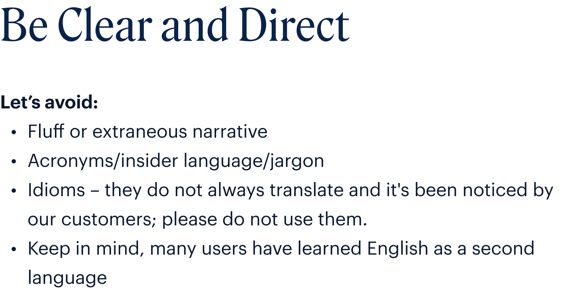
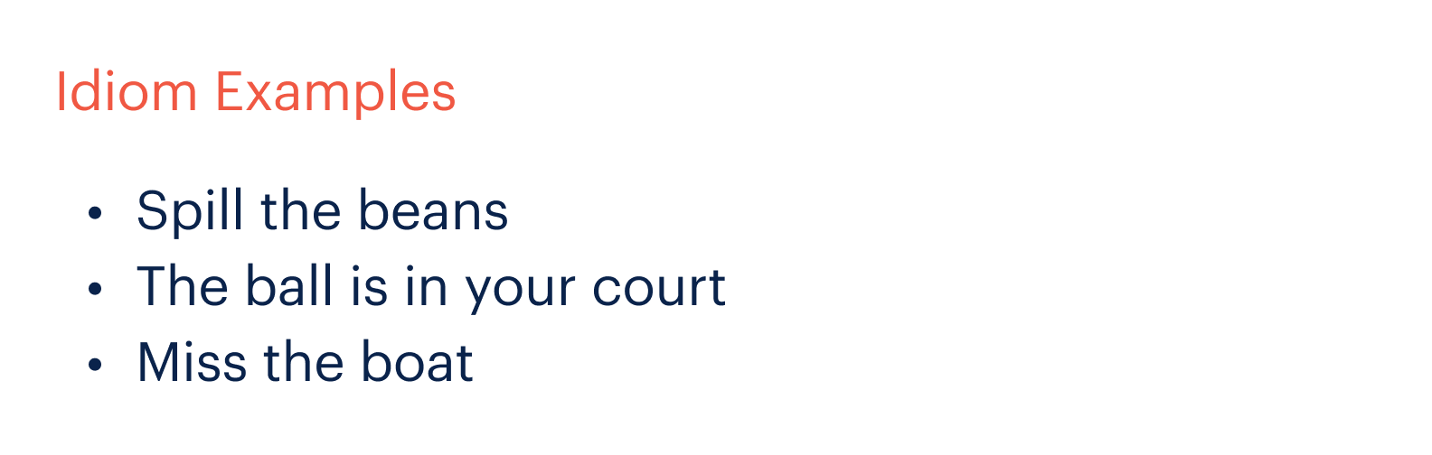
VoiceClear & Direct
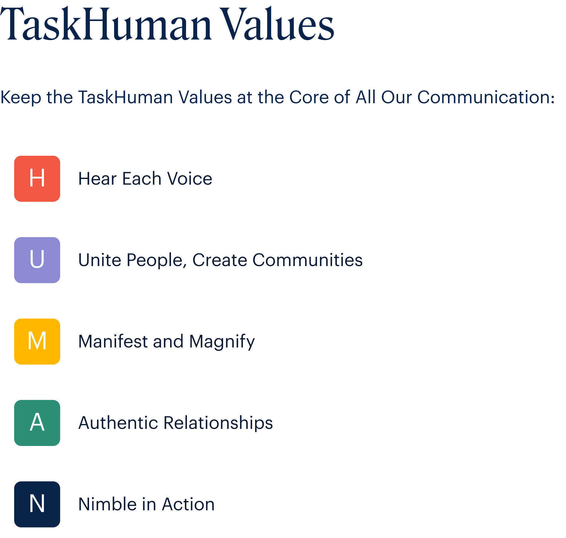
VoiceGrammar & Values

EmailCall to Actions
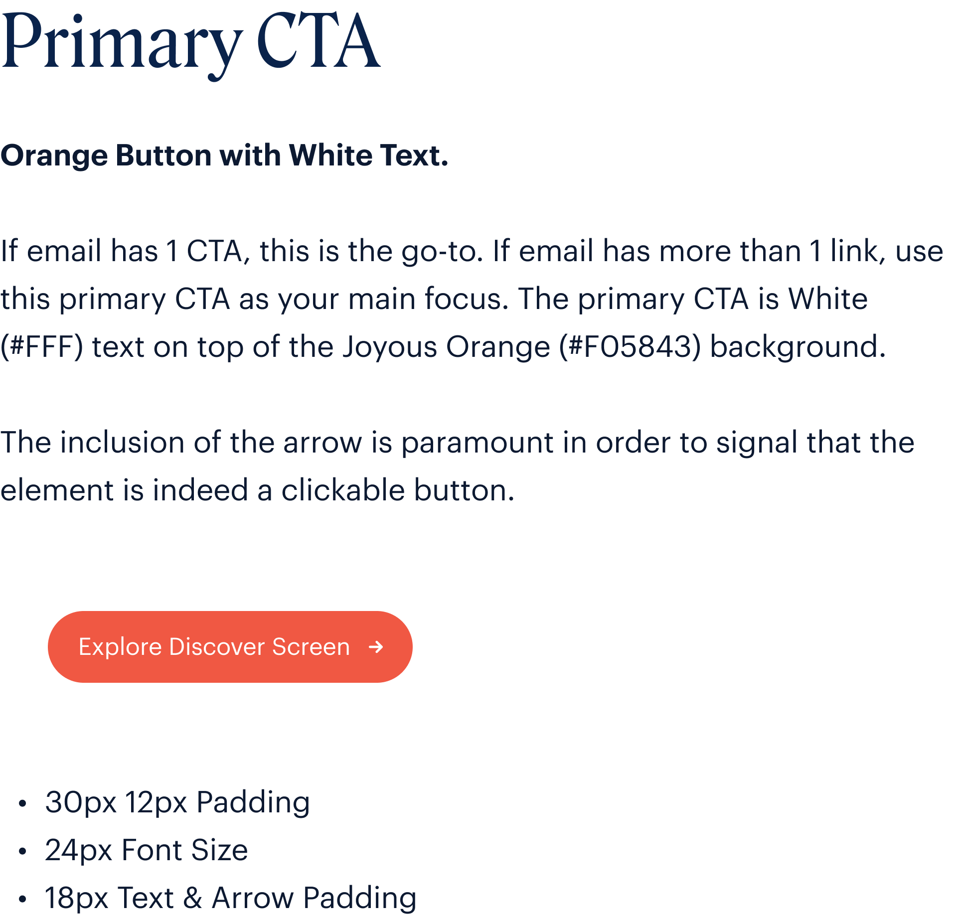
EmailCall to Actions
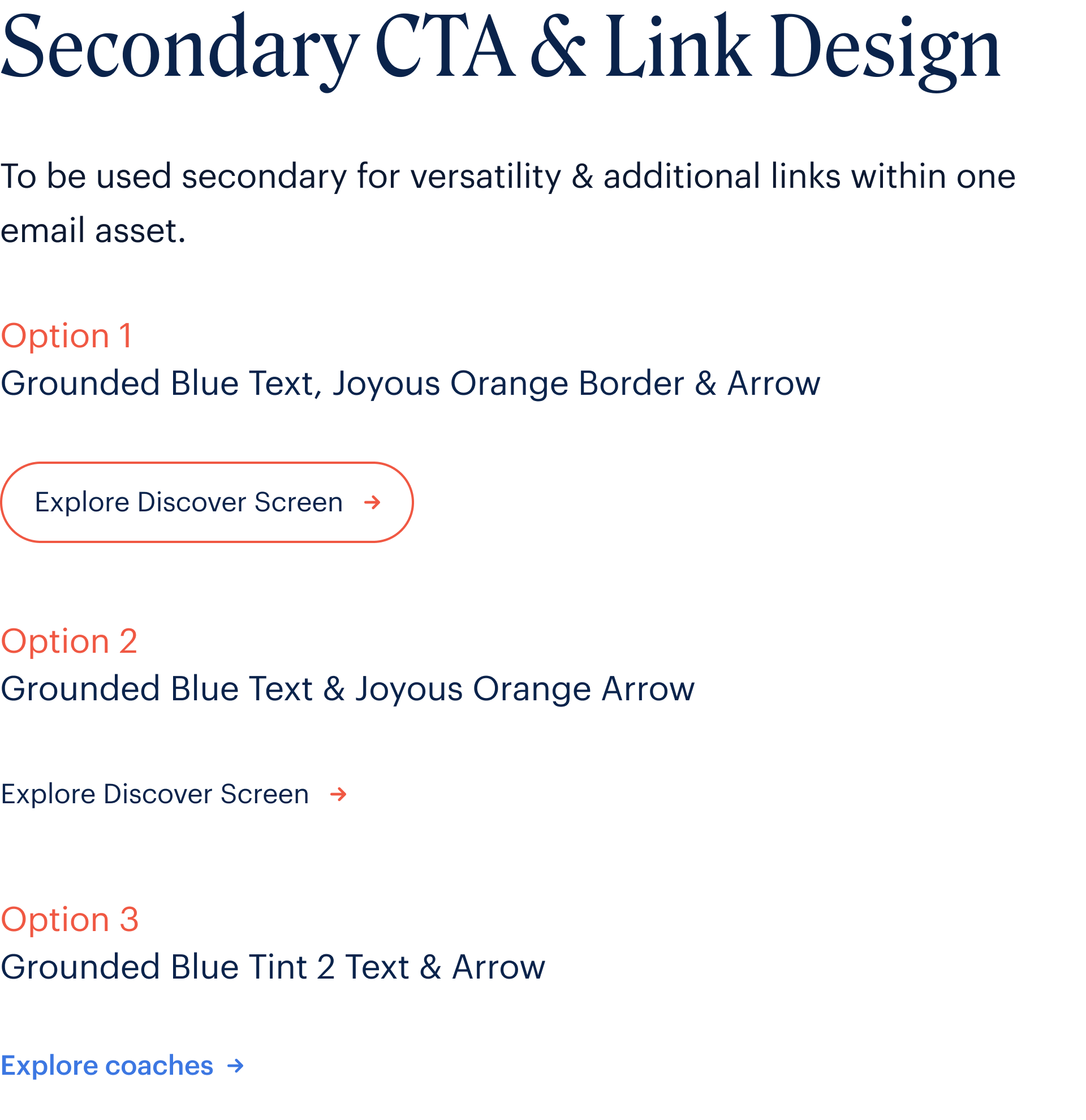
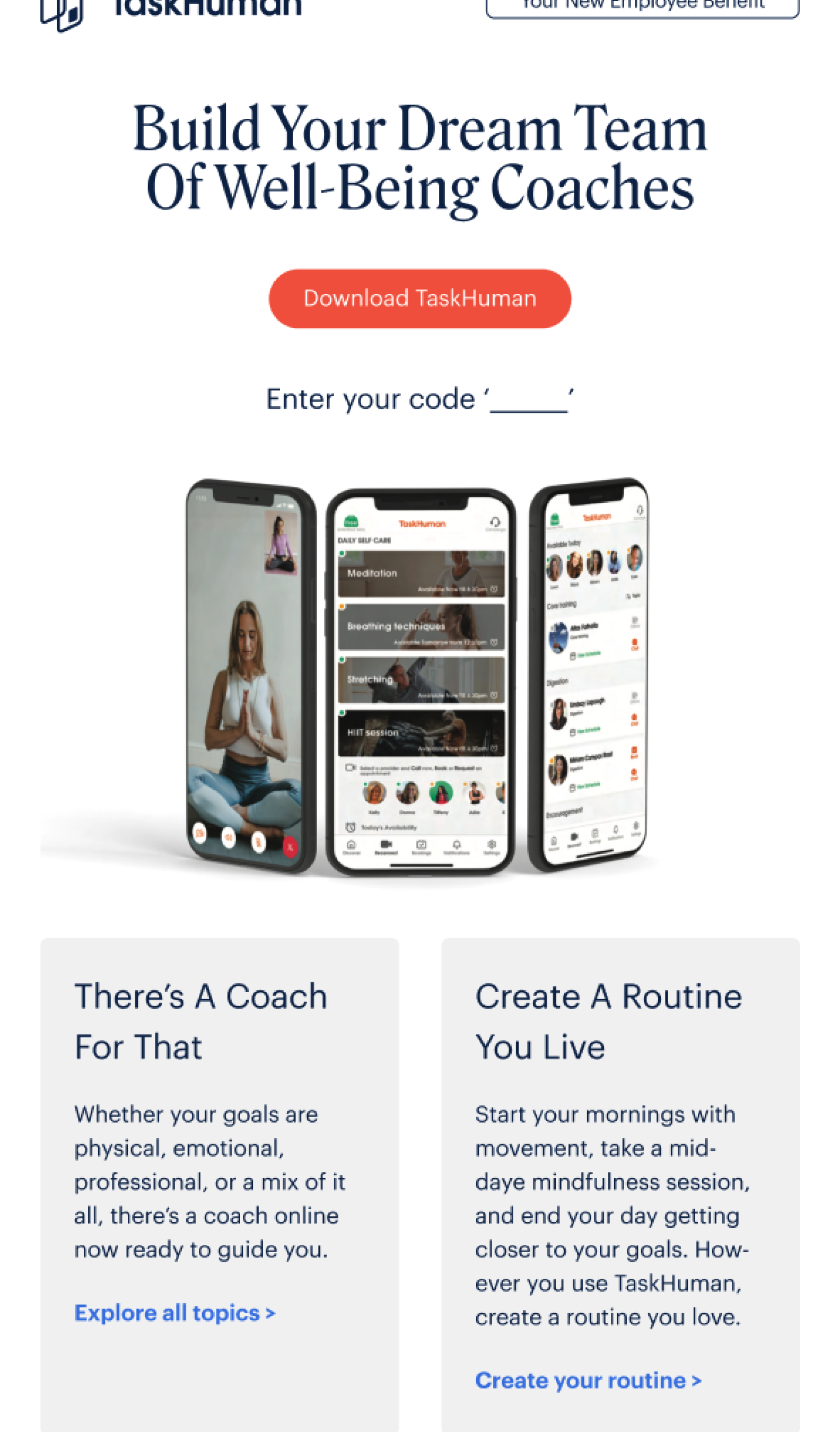
EmailCall to Actions
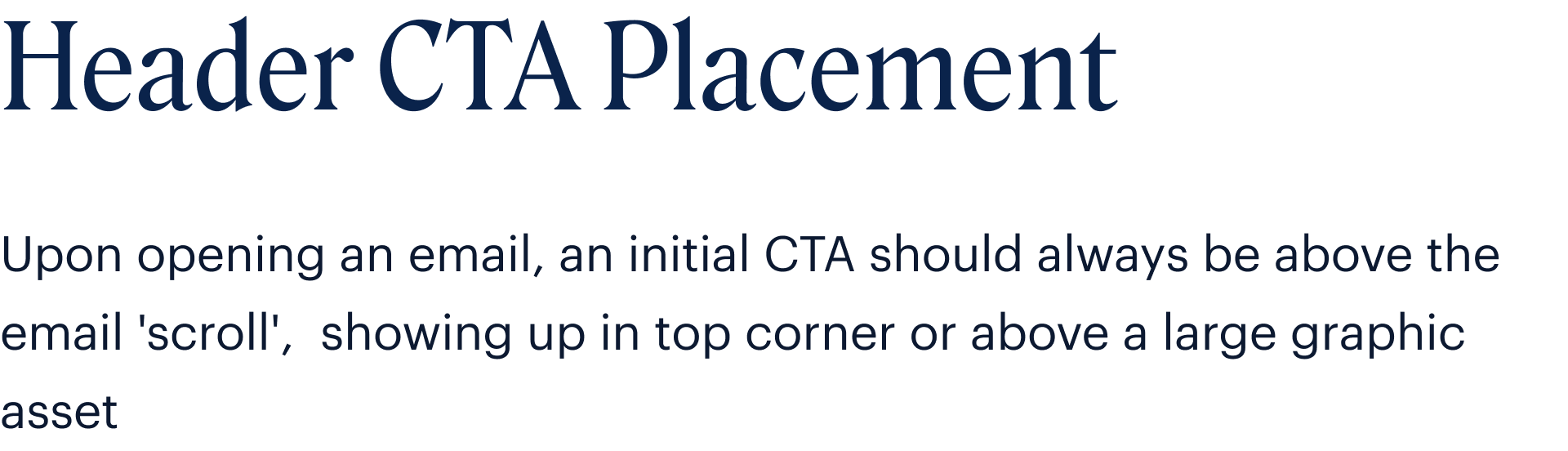


EmailCall to Actions


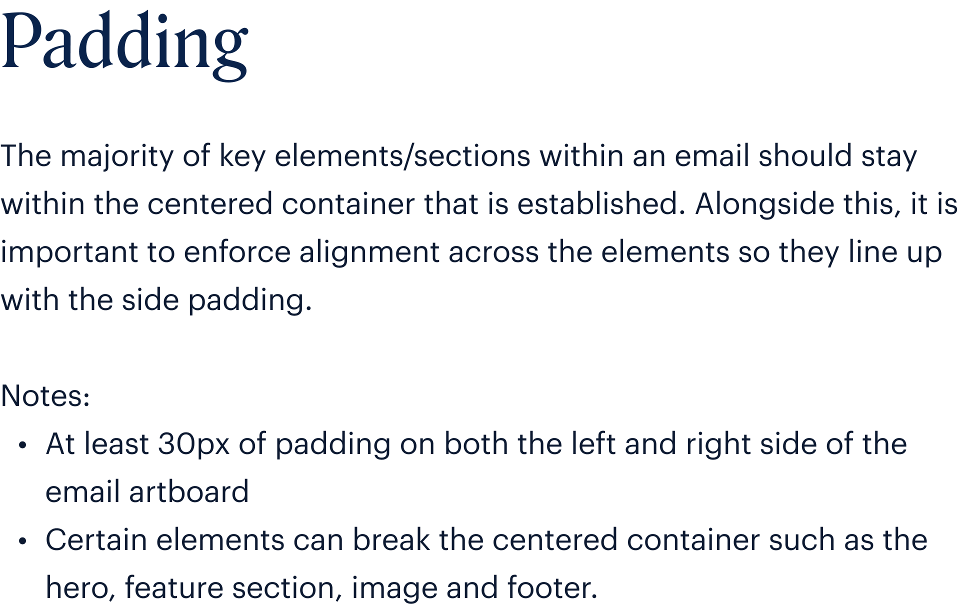
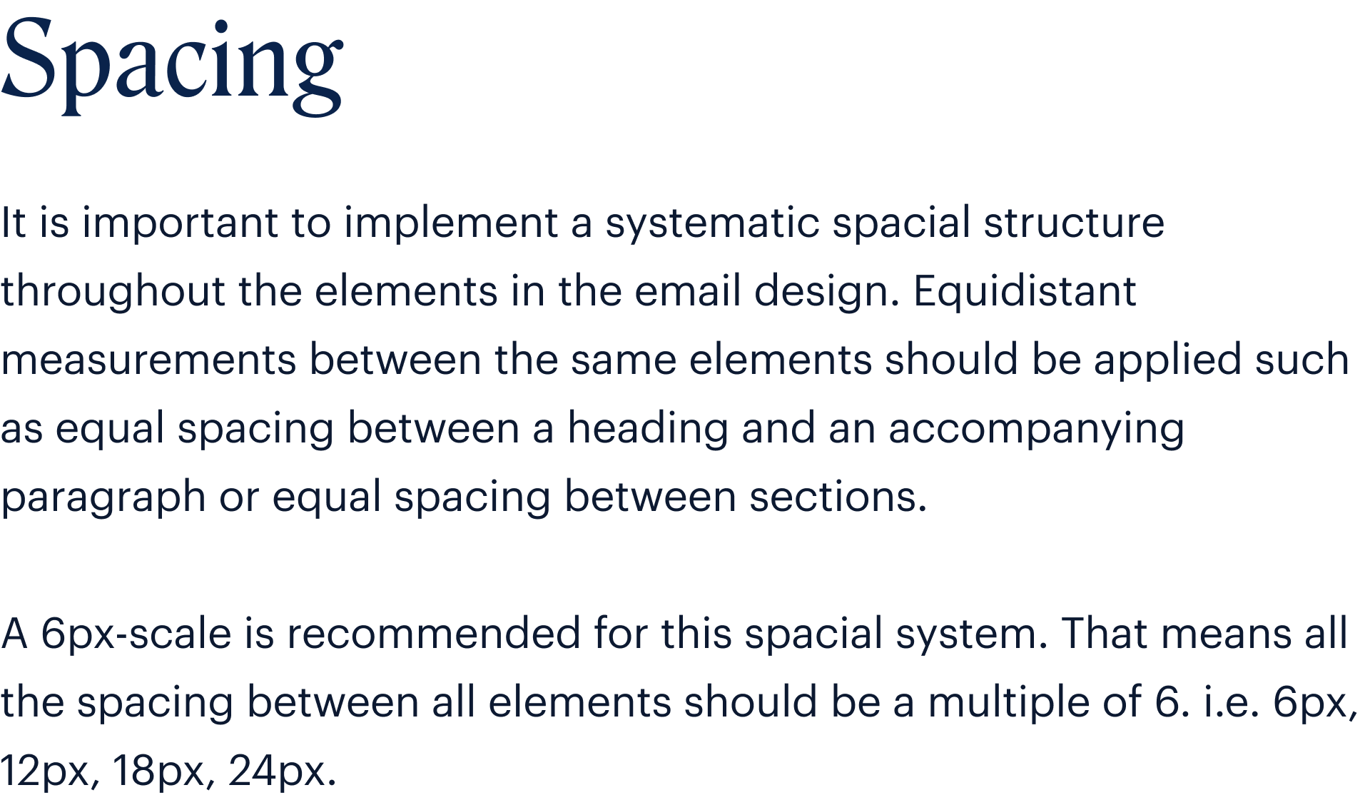
EmailPadding

EmailSpacing
EmailColor

EmailTypography

EmailTypography

EmailHero Image Usage

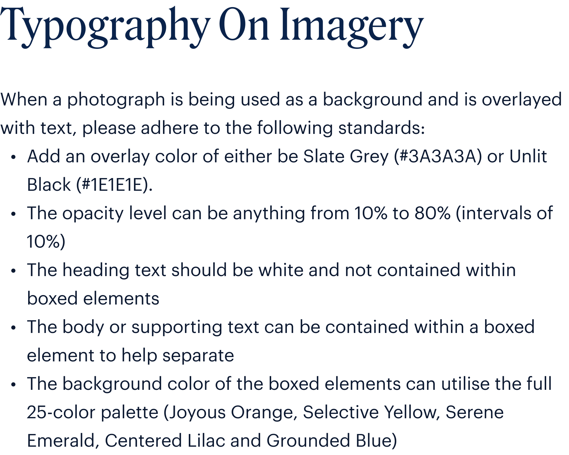
EmailVisual Elements


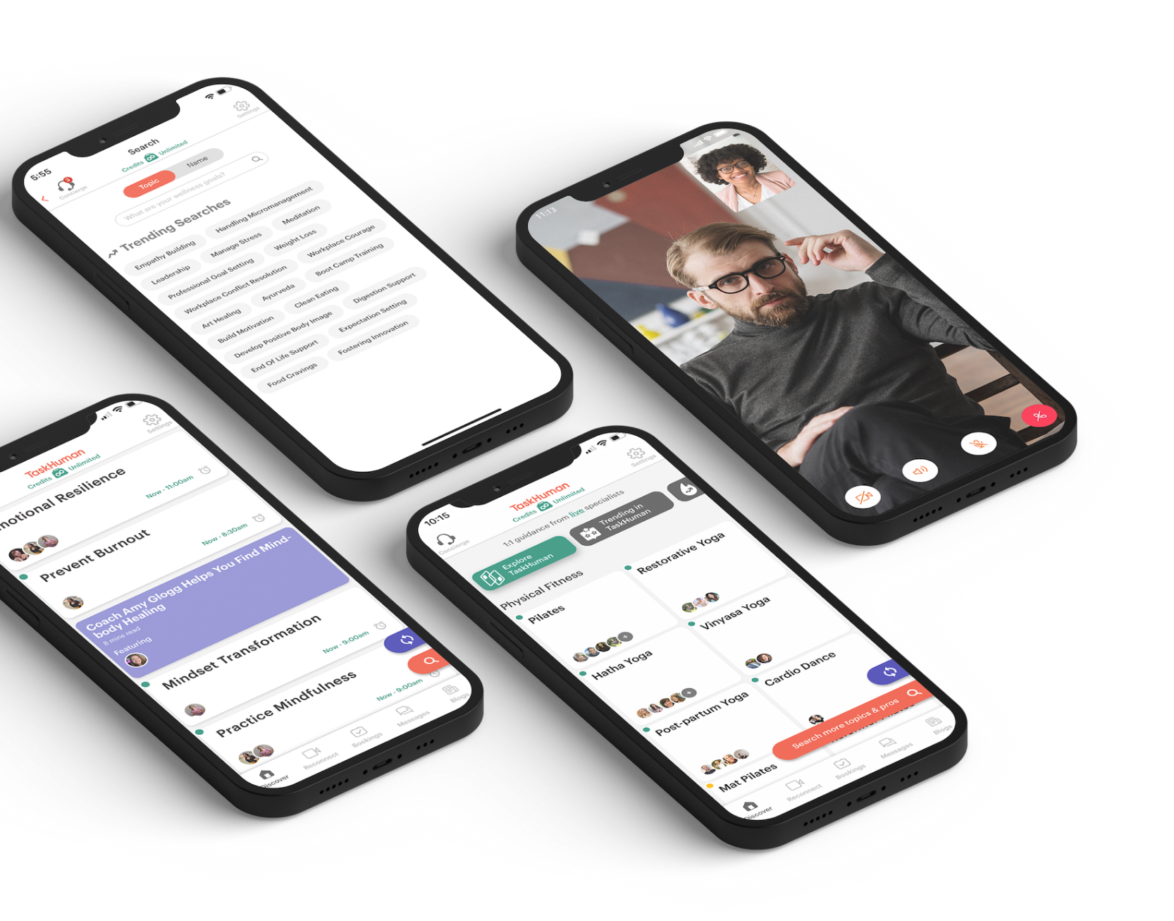
EmailCell Phone Usage


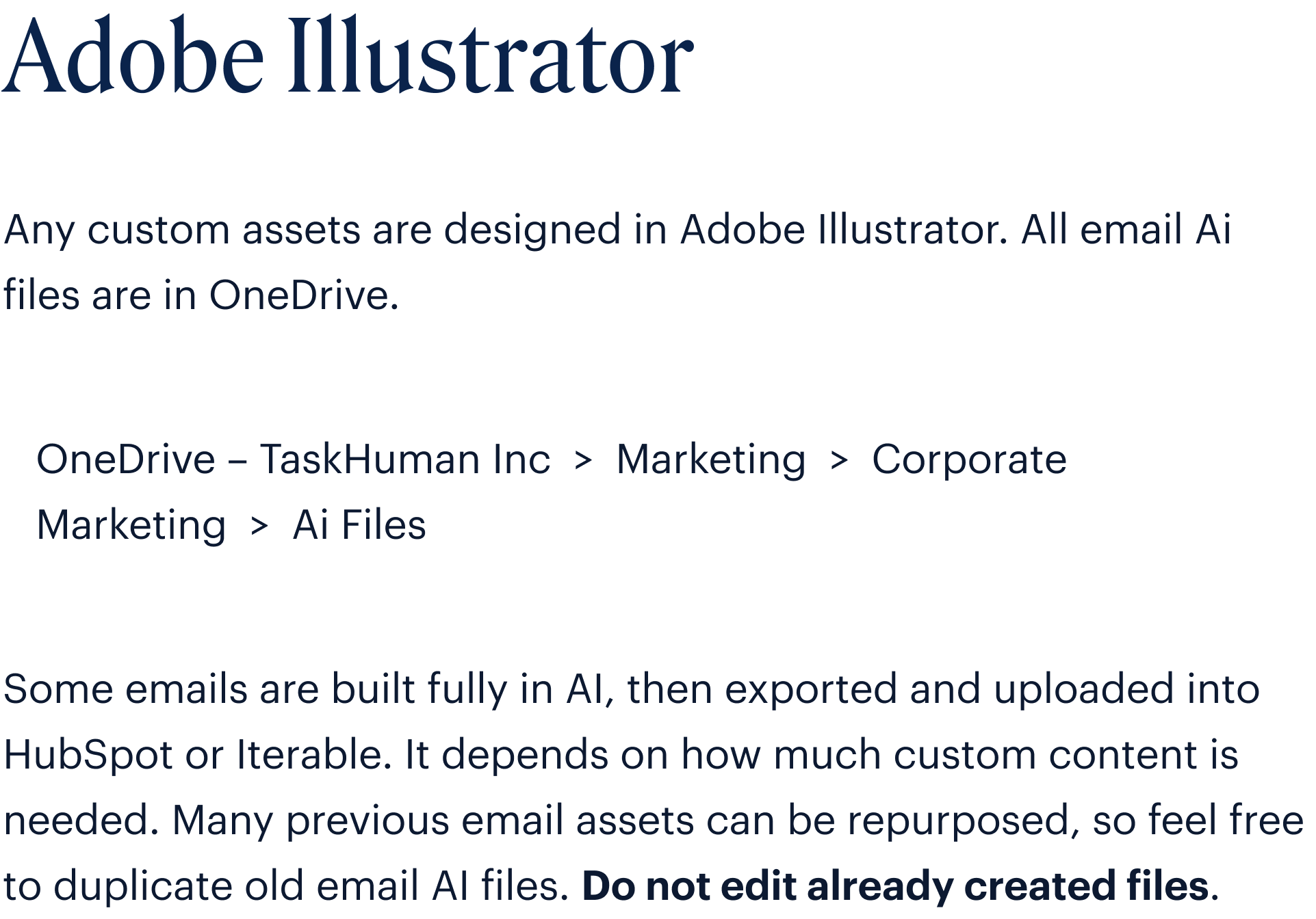
EmailIllustrator Setup

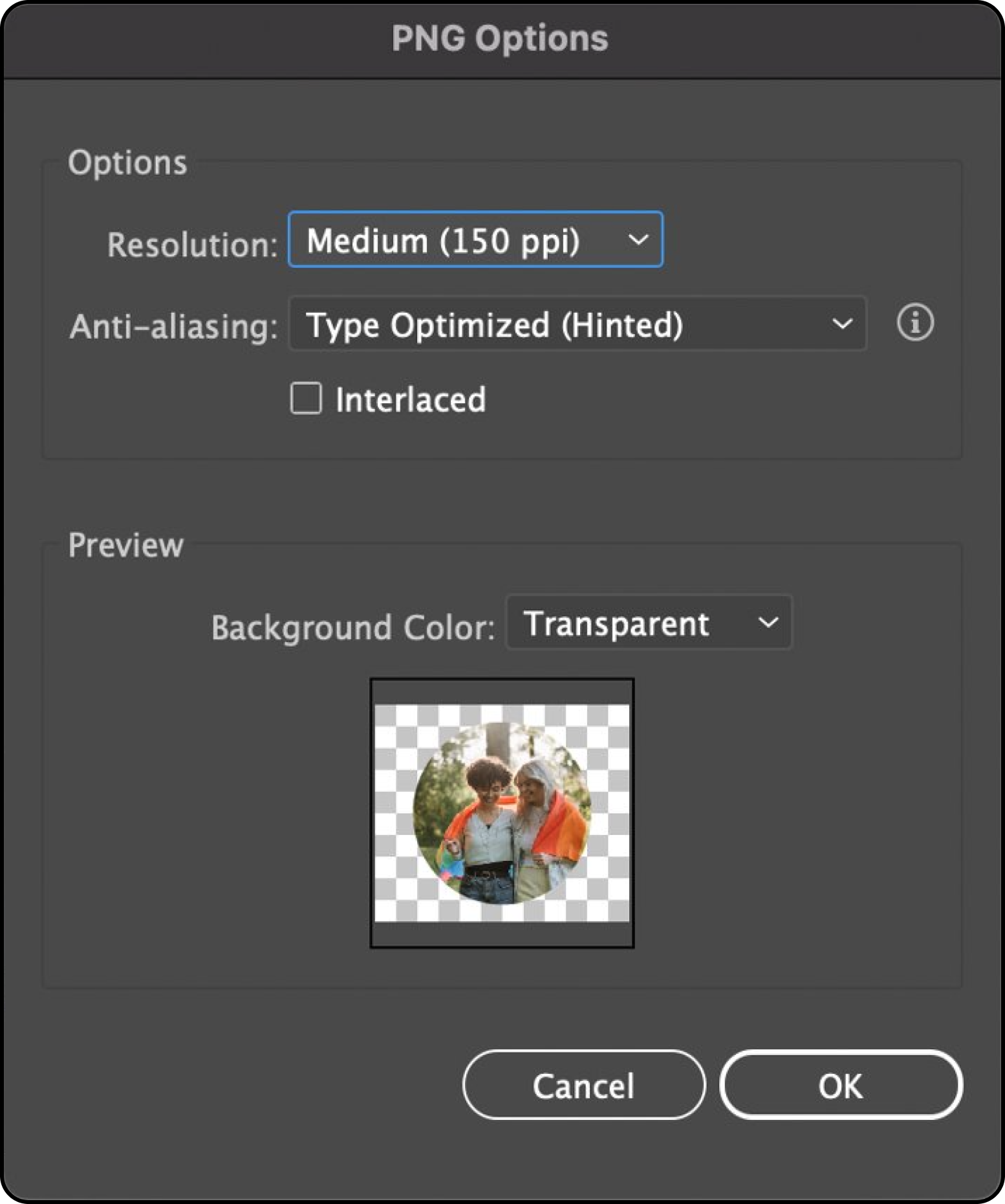
EmailIllustrator Export

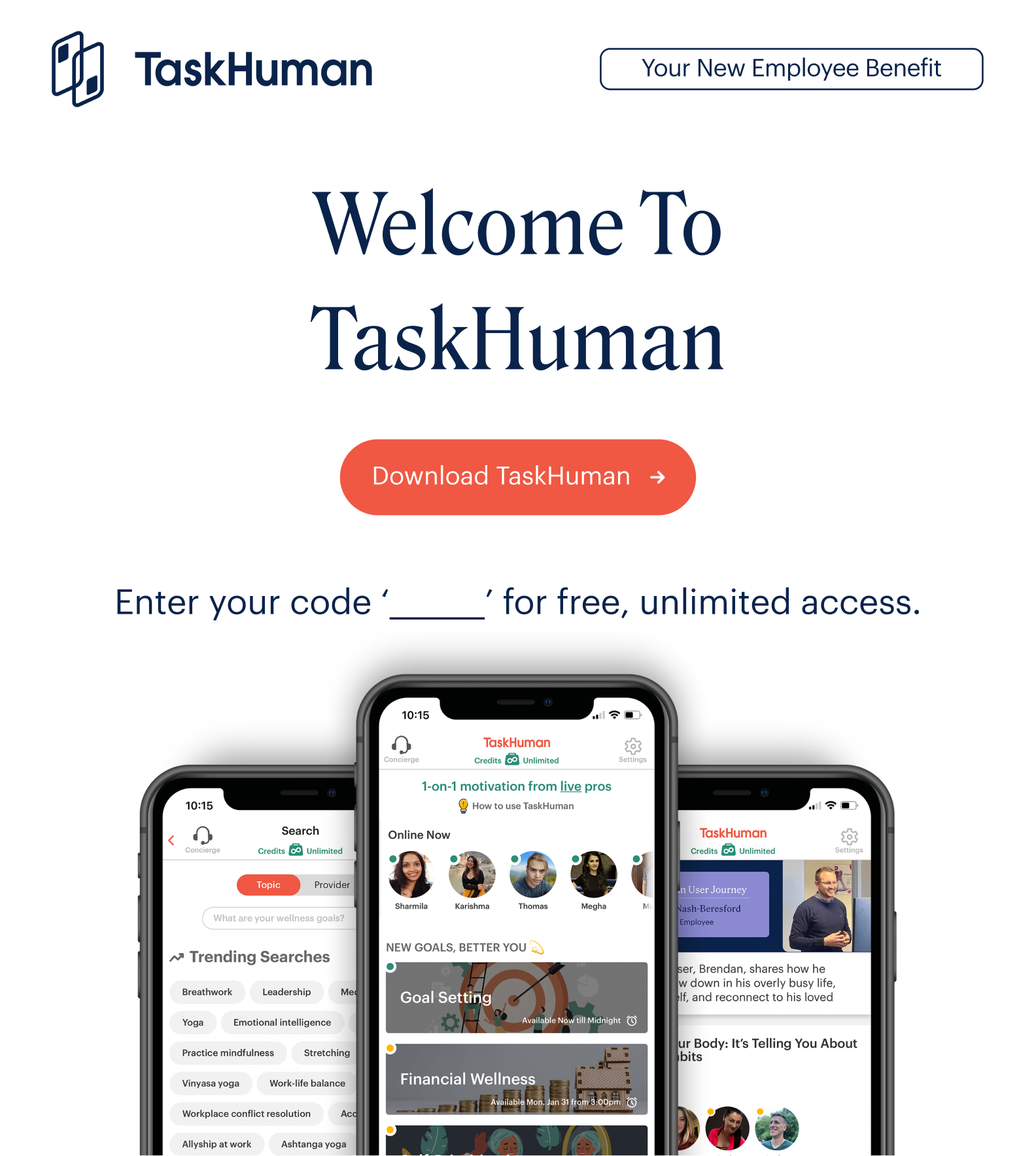
ExamplesOverview

ExamplesOverview

ExamplesOverview

ExamplesOverview
ExamplesOverview

ExamplesOverview

ExamplesOverview
Examples

Examples

Examples

Examples
Examples
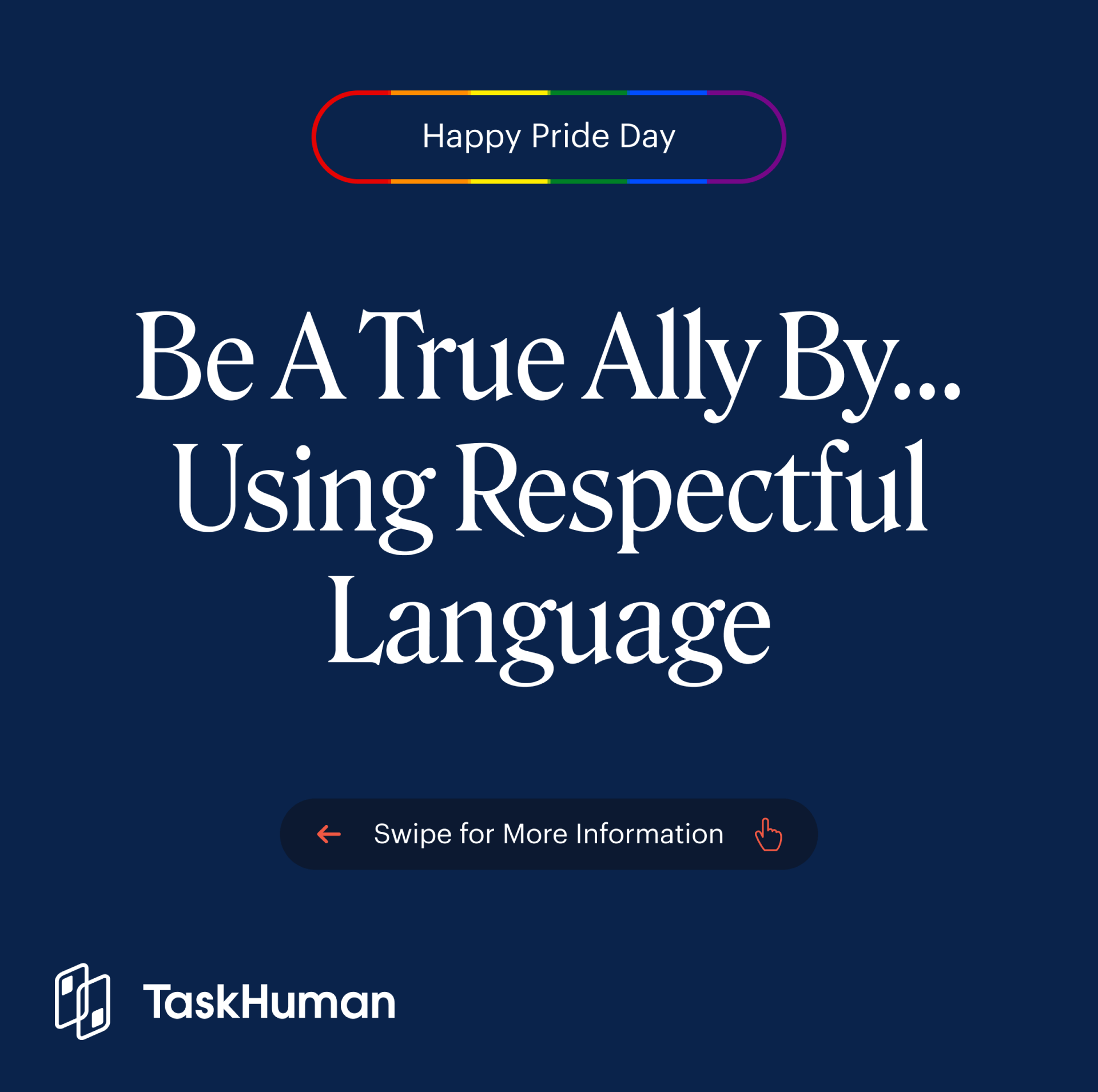
Examples


Examples


Examples

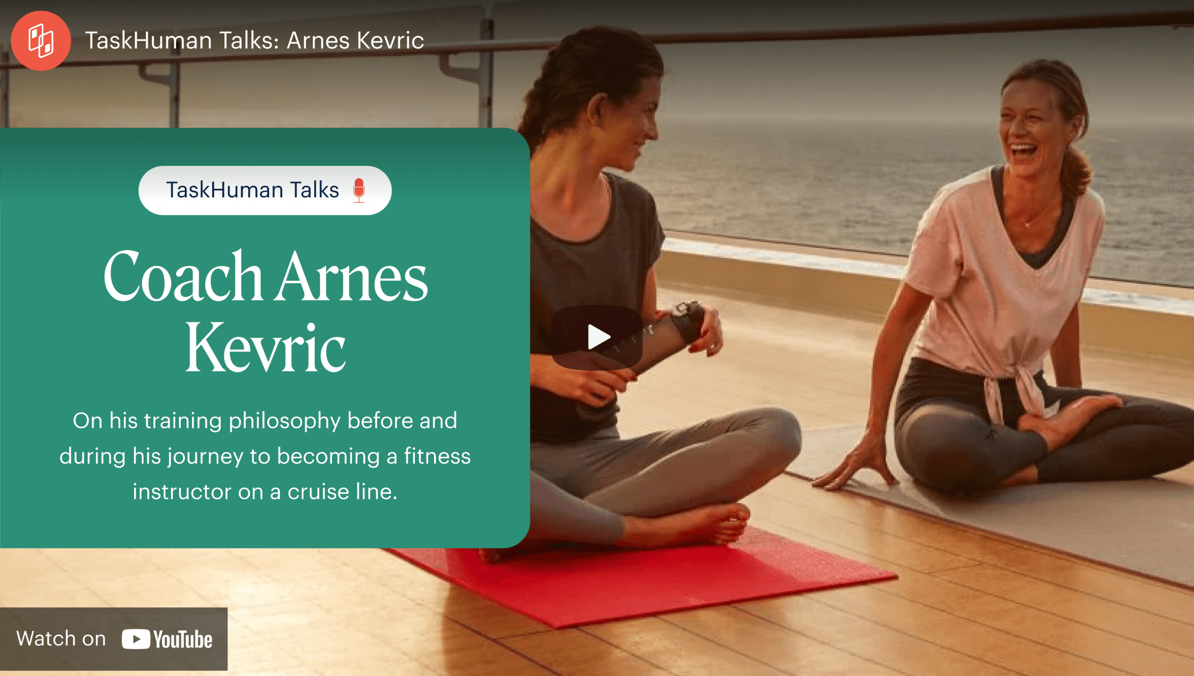
Examples
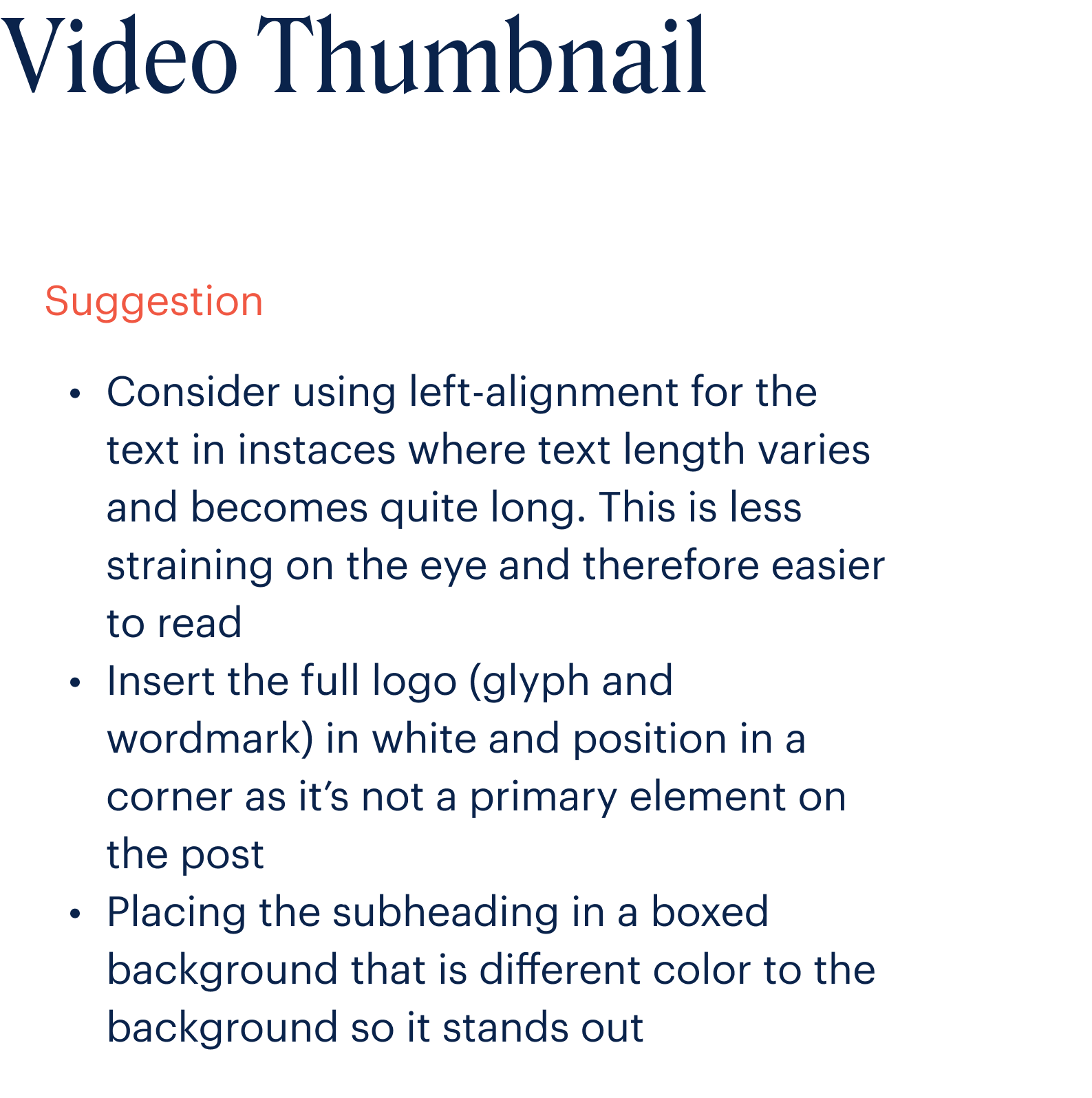
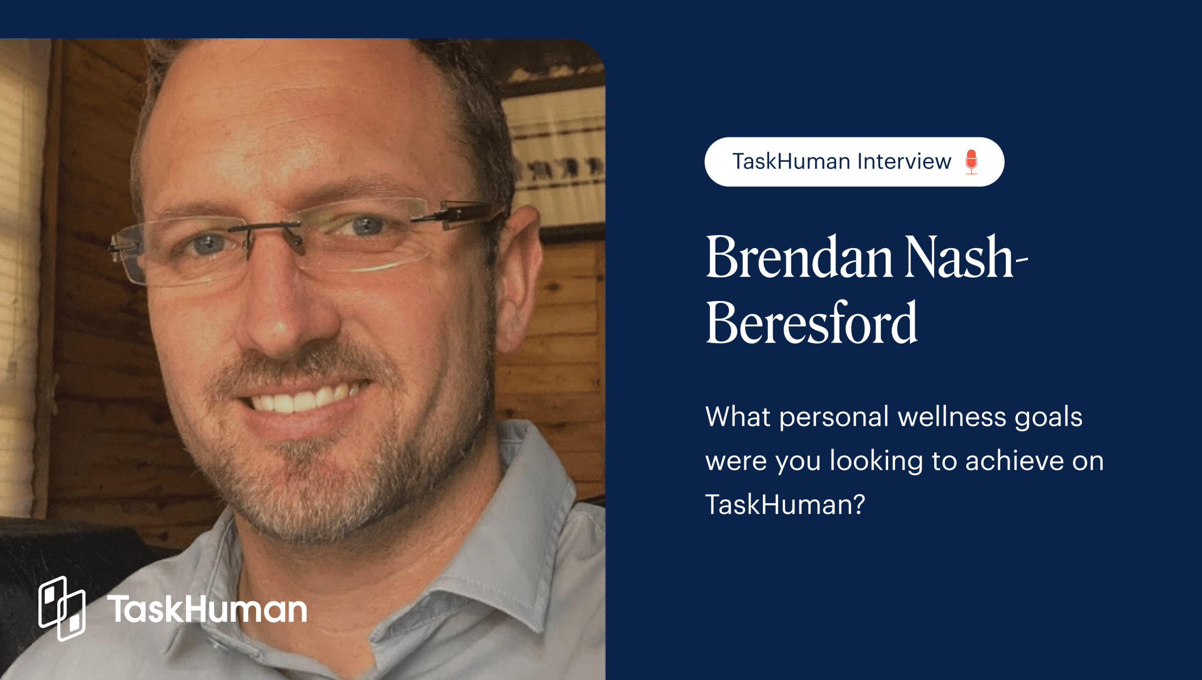
Examples